· 20 min read
How to design an expo floor plan that improves visitor circulation

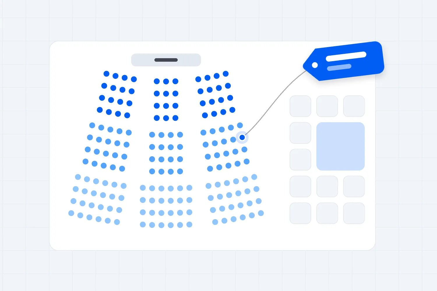
Design your expo floor plan around the routes visitors need, the places they will stop and the busiest moments of the day. Protect those spaces before you allocate booths, then test whether people can enter, find relevant exhibitors, join a demonstration and leave without blocking each other.
So you've got a hall, exhibitors who want good positions and a ticketed audience expecting a worthwhile day. It's tempting to start by fitting as many stands as possible into the room. But every space you sell creates movement around it. That movement needs somewhere to go.
A visitor standing in a queue is still occupying your floor. So is someone watching a demonstration, meeting a friend or reading a map. If you only draw booths and aisles, you've left out half the experience.
This guide walks you through a practical way to plan circulation, check your busiest areas and brief the people who will operate the hall. You'll also get a worked example and a review process you can use before selling the final booth positions.
Start with what visitors actually came to do
The first thing you want to do is write down the main reasons someone buys a ticket. A professional buyer looking for suppliers has a different route from a family trying products at a consumer expo. Your floor plan needs to make those visits possible.
For a trade exhibition, visitors might want to compare several suppliers in the same category, attend a technical session and book a private conversation. For a consumer expo, they might want to sample products, watch a demonstration and buy something they can carry home.
Ask what each visit involves physically. Does a product need a quiet conversation? Will visitors gather around a screen? Does an activity need a queue, a briefing area or somewhere to put bags? Don't treat all exhibitors as identical rectangles because their booked footprints are the same.
Then choose what good circulation means for your show. You might want visitors to find their chosen category without repeated detours, give smaller exhibitors a reasonable chance of discovery and keep the main route usable during demonstrations. Those are decisions you can test.
You cannot promise every stand the same traffic. An entrance position, an interior row and a stand beside a popular attraction will behave differently. You can make those differences clear, avoid hiding exhibitors behind large structures and give each area a useful reason to visit.
Keep the commercial promise realistic. Our exhibitor prospectus guide explains how to describe the space and audience you're selling. Use the same language in the floor plan. A premium location should have a specific benefit you can explain, rather than an impressive label attached to an ordinary corner.
Our guide to mapping seating and booths covers the wider allocation process. Here, we're concentrating on what happens between the stands, including the queues and programme changes that put pressure on visitor routes.
Get the real venue drawing before allocating space
Work from the venue's current drawing, with dimensions and the correct room configuration. A brochure outline is useful for choosing a hall. It isn't enough for placing stands, temporary walls, equipment and visitor routes.
Walk the space with the venue team. Mark columns, doors, changes in level, fixed service points, toilets, lifts and anything else that affects movement. Ask which entrances will actually operate during your show. A door on a drawing may lead into a service area visitors cannot use.
Also mark the spaces your event needs behind the scenes. Storage, waste collection, staff access, technical equipment and deliveries compete with the same available floor area. If you leave them out, they tend to appear later in a convenient empty corner. That corner may already be doing an important job.
Keep venue restrictions beside the drawing, including the approved capacity for the proposed configuration and the process for reviewing changes. Ask who must approve the plan and when. This may involve the venue, a competent safety adviser and the relevant local authority or fire authority, depending on where you operate.
There is no universal aisle width that makes every expo safe. The required clear space depends on the venue, local requirements, occupancy, activity and the actual configuration. Get those requirements confirmed for your event. Don't borrow a dimension from a blog and treat it as approval.
The UK's Health and Safety Executive includes entrances, circulation and emergency access in its venue and site design guidance. That is useful planning guidance; it doesn't replace the rules or approvals that apply to your own venue.
Create a versioned working drawing. Put the event name, date, revision number and owner on it. When someone asks whether a booth can move, you should know which plan they're discussing and which other decisions that change affects.
Draw the visitor routes before the booths
Start at the public entrance and follow the journey a first-time visitor would take. Where do they queue? Where do they check in? Where can they stop to understand the hall? What do they see when they first enter the exhibition?
Leave an arrival area where people can get their bearings without holding up everyone behind them. Put the directory or map where someone can read it beside the moving stream. If the information desk sits directly in front of the door, every question creates another obstacle.
Next, draw the main route between the entrance, exhibition areas and major facilities. Add connections between rows so visitors can change direction without walking to the end of the hall. Long rows with few crossings can make a nearby stand surprisingly awkward to reach.
Keep browsing space separate from through movement wherever the configuration allows it. Someone comparing products moves differently from someone heading to the toilets. If both groups must use the same narrow stretch beside a popular demonstration, you've concentrated several demands in one place.
You don't need to force visitors through every booth. A compulsory route can become frustrating when someone wants one supplier, needs a break or has limited energy. Give people a clear way to explore and reasonable shortcuts when they know where they want to go.
Consider different journeys on the same drawing. Trace the route for someone using a mobility aid, a visitor with a pushchair where families are expected, an exhibitor returning from a break and someone carrying purchases. Ask where they would need to turn, pause or pass other people.
Emergency routes need their own review. A route that works during ordinary browsing may face very different demands when people must leave quickly. Have the appropriate professionals assess the plan rather than assuming your visitor arrows also demonstrate safe evacuation.
At this stage, the drawing should show how the hall works even with the booths removed. If the routes only make sense after you've added arrows everywhere, simplify the arrangement before adding more instructions.
Choose a layout that fits the way people browse
A grid of booth rows makes categories and stand numbers straightforward to organise. It can suit a show where visitors arrive with a list of suppliers. The weakness is that repeated rows can look alike, and an uninterrupted aisle can encourage people to pass several stands without noticing them.
Give a grid meaningful cross-connections and visible landmarks. A clearly named category, a meeting area or a demonstration space can help visitors locate themselves. Avoid making every landmark another crowd-generating attraction. Some should simply help people understand the room.
A loop can encourage exploration because visitors can follow a continuous route. It works best when there are places to leave the loop, useful connections across the hall and a clear route back to facilities. Don't confuse a suggested browsing circuit with an enforced one-way system.
Category zones help visitors find relevant exhibitors. They're particularly useful when buyers want to compare similar products. But a zone without a destination or a visible entrance can become a quiet pocket, especially if another category dominates the arrival area.
A mixed arrangement is often worth testing. You might use a clear main route, short booth rows on either side and category destinations further into the hall. Choose it because it solves specific movement problems, rather than because the drawing looks more interesting.
Check what people can see at each decision point. Can they recognise the next category? Can they see that another row exists? Does a large island stand create a visual wall? Sightlines affect whether visitors understand their options before they commit to a route.
Our event seating chart guide covers layouts for seated parts of an event. Keep those room arrangements connected to the exhibition plan, especially where session entrances and exits open directly onto the expo floor.
Whatever arrangement you choose, test it against your busiest programme moment. A beautiful loop during a quiet morning can fail when a session ends and visitors all head towards refreshments. The programme and floor plan need to work together.
Spread destinations without creating new bottlenecks
Popular exhibitors, demonstrations, catering and meeting areas give visitors reasons to move through the hall. Use them deliberately. If everything people want sits beside the entrance, you shouldn't be surprised when the back rows feel empty.
Place useful destinations in different parts of the exhibition, where their crowds can fit. A demonstration towards the rear can encourage deeper exploration, but only if the route to it is clear and the audience has somewhere to stand. Moving a bottleneck doesn't solve it.
Be careful with coffee as a traffic device. Yes, people will walk for it. They'll also queue, collect drinks, add milk, wait for colleagues and look for somewhere to sit. Put those actions on the plan rather than assigning the catering counter a tiny rectangle and hoping the rest sorts itself out.
For practical service planning, our conference coffee quantities guide helps you think through demand. Bring the caterer into the layout discussion as well. The queue footprint depends on the service arrangement, not just the quantity ordered.
Keep noisy demonstrations away from activities that depend on conversation, where possible. If someone cannot hear a supplier explain a product, the nearby crowd is costing that stand something. Ask exhibitors what they intend to do, not simply what furniture they need.
Check adjacency before approving positions. Two sampling stands can create overlapping queues. A popular speaker beside a quiet consultation area can undermine both. An equipment display may need a handling area that isn't obvious from the exhibitor's requested footprint.
Agree how visitors will join and leave each activity. For a demonstration, that might mean an audience area, a waiting area and a clear release route. For a booked appointment, it might mean a small waiting space that doesn't interrupt the adjacent booth.
Avoid telling exhibitors they can solve crowding by using the aisle. Their paid footprint and the visitor route serve different purposes. If an activity cannot operate inside its approved space, change the activity, allocate suitable space or move it before opening.
Plan queues as part of the floor plan
Queues are easy to overlook because they don't exist during your venue visit. They appear when the experience is busiest, which is exactly when you have the least room to improvise.
List the places where visitors may wait. Include ticket checks, bag searches where used, information desks, refreshments, demonstrations, paid activities and popular stands. Ask the operator of each point what happens when demand arrives faster than they can serve it.
Draw the expected queue direction and the space reserved for it. Check whether the queue crosses another route, hides a stand, blocks a door or ends in an awkward junction. A line that looks tidy beside the counter may create a problem further back.
Separate people who are waiting from people who have finished. At catering, the collection point and condiment area can cause more confusion than the ordering queue. At an activity, visitors leaving may walk directly into those waiting to enter.
HSE's crowd control guidance advises providing a safe way out of queues and keeping emergency access routes clear. Use that principle when discussing the queue arrangement with your venue and safety team.
Give staff a visible trigger for action. It could be the queue reaching a marked point on the approved drawing. Agree what happens next, such as opening another authorised service point, pausing admissions to the activity or redirecting visitors to an available alternative.
Don't promise a queue length based on guesswork. If you have previous operating records, use them. If you're launching, ask the supplier to demonstrate its service process and test realistic surges. A counter's average throughput doesn't describe every delay or every visitor's needs.
Finally, make queue changes part of your approval process. Adding barriers on the day can change accessible routes, door access and crowd movement. Staff should know who can authorise those changes and when they need specialist advice.
Check the peak moment with a worked example
Here's where the floor plan becomes more than a drawing. Take one busy moment and calculate what it asks the hall to accommodate. Keep the assumptions visible so your team can challenge them.
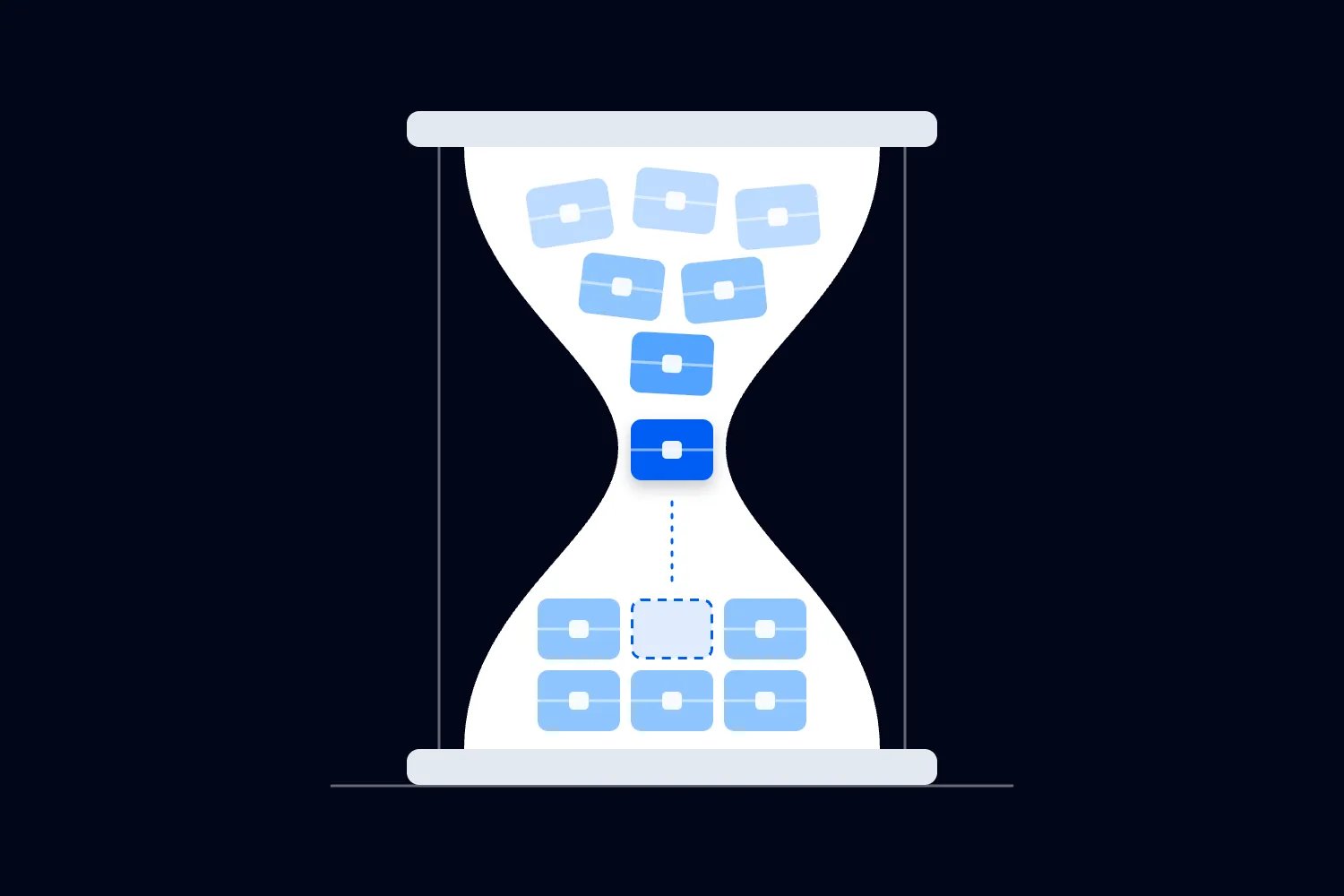
Imagine a fictional paid expo where a session finishes beside the exhibition. For this example only, 180 visitors want refreshments over ten minutes. That creates an assumed demand of 18 people per minute. These numbers illustrate the calculation; they are not industry benchmarks.
Suppose the caterer's tested arrangement serves 12 people per minute during that period. Over ten minutes, it serves 120 people. If everyone remains in the queue, demand exceeds service by 60 people. That's the simple arithmetic your drawing needs to acknowledge.
Now test a second arrangement that serves 16 people per minute under the same fictional conditions. It serves 160 people over ten minutes, leaving 20 still waiting. Faster service reduces the backlog in this example, but it doesn't tell you how much safe queue space the actual event needs.
That calculation assumes a steady arrival rate, steady service and no abandonment. Real arrivals often bunch together, and service can slow. Use the example to ask better questions, then test the conditions your show is likely to face.
What if visitors also stop for a demonstration beside the queue? What if the session doorway releases people into the same aisle? What if a machine fails? A floor plan should account for these interactions instead of treating each activity as though it operates alone.
You can improve the arrangement in several ways. Move the service point to a suitable area, improve service capacity, provide another approved location or change the programme to reduce simultaneous demand. Choose the combination your suppliers and venue can actually deliver.
Don't translate the backlog into a universal area-per-person allowance. Safe capacity and queue design require a proper assessment for the space and crowd. The calculation shows a potential operating problem, not a safety approval.
Make access continuous through the whole visit
An accessible entrance is only the beginning. Visitors need to reach exhibitors, activities, refreshments, toilets and exits through routes that remain usable while the show is operating.
Start by tracing those connections on the plan. Then ask what might interrupt them after opening. A loose chair, a queue, a cable cover, a display projecting beyond a booth or a cluster of people reading a sign can change what was clear during the inspection.
For US events, the Access Board's ADA guide to accessible routes explains connections, route components and clearances. Apply the requirements relevant to your venue and event with qualified advice. Other countries have their own requirements.
Invite people with relevant access needs into your review where possible. Ask about the complete experience, including turning, reaching a counter, joining an activity and finding somewhere to rest. A route can be technically present while the activity at its end remains difficult to use.
Provide information visitors can use before arrival. Explain the operating entrance, available facilities and how to contact your team about access questions. Keep those details consistent with the actual plan, especially if a room or entrance changes.
Wayfinding should work without relying on colour alone. Use clear names, legible text and consistent symbols where appropriate. If category colours help people navigate, pair each colour with the category name. Someone should still understand the route without distinguishing the colours.
Check signs at the height and position visitors will encounter them. A directory hidden behind a queue isn't doing much. Nor is a sign that only makes sense after you've already chosen the wrong aisle.
Make maintenance someone's job during the show. The person responsible should know how to report a blocked route, remove an unauthorised obstruction and involve the right team when a bigger change is needed. Access belongs in the operating brief, not only in the opening inspection.
Protect booth visibility with clear display rules
Your floor plan and exhibitor rules need to agree. A stand may fit its allocated rectangle while a tall wall hides its neighbour or its demonstration gathers visitors across the route.
Ask for the display information that affects circulation before approving the stand. That includes open sides, wall positions, tall elements, counters, audience areas and any activity that draws a group. Complex builds need the venue's required technical review as well.
The International Association of Exhibitions and Events distinguishes line-of-sight and cubic-content approaches in its display rules guidance. Those are different ways of setting display boundaries. Choose and communicate rules appropriate to your event rather than mixing expectations after exhibitors have designed their stands.
Explain the rules before selling positions. If a smaller exhibitor expects an open view and you later approve a neighbouring wall, you'll have an avoidable dispute. Draw the condition clearly and include it in the relevant booking information.
Review corner and island stands in context. More open sides can create more places for people to gather. A premium footprint doesn't automatically provide a suitable audience area for a live demonstration.
During build, inspect what has actually arrived. Exhibitors may change furniture, add a display or bring equipment that differs from the approved plan. Record the issue and resolve it through the agreed process before visitors enter.
Don't let sales staff approve operational exceptions alone. They can explain the commercial consequences of moving a stand, but the venue and responsible event team need to check movement and safety. Give them one current drawing so nobody makes promises against an older version.
Test the plan with people who haven't drawn it
Once you're familiar with the hall, you stop noticing what a first-time visitor won't understand. Bring in someone who hasn't worked on the drawing and give them realistic tasks.
Ask them to enter, find a specific category, reach a named stand, join a demonstration and locate the toilets. Let them explain their choices. Every pause, wrong turn and question tells you where the plan or signage needs work.
Run another test around the programme. Trace visitors leaving a session while others arrive, browse and queue. Look for routes crossing at the same point and for waiting groups expanding into movement space.
Test an ordinary problem too. What happens if a service point closes, an exhibitor's activity attracts more people than expected or the information desk has a long line? Agree a response that doesn't depend on inventing a new route in the moment.
Use the built hall for a final walkthrough. Tape lines and empty rectangles cannot show every obstruction created by real displays. Check sightlines, furniture, queue barriers and signs from the visitor's position. Confirm that approved routes remain clear.
Record changes on the drawing and brief the affected teams. If a demonstration moves, the programme, directory, staff instructions and exhibitor information may all need updates. A corrected floor plan won't help if visitors still follow an old map.
Use a short review sheet for each busy area
Give your operations team a review sheet they can complete together. Start with the location and the activity, then write who uses it, when demand is highest and where people wait. Add the route people use to arrive and the route they use to leave.
For a demonstration, record the expected audience arrangement, the person supervising it and the point at which they stop admitting more visitors. For refreshments, record ordering, payment, collection and clearing away. Each of those actions can occupy a different part of the floor.
Include the neighbouring activity. A queue might fit its own reserved area until a nearby session ends. A stand might have clear access until the next exhibitor starts a sampling activity. Looking at each point separately misses the problems that happen between them.
Finish the sheet with the agreed response and its owner. If the arrangement fails, who can pause the activity? Who speaks to the exhibitor? Who checks a proposed alternative with the venue? Put names or roles against those decisions so everyone knows whom to contact.
Keep the sheet brief enough to use during the event. Your floor supervisor shouldn't need to read a long report while a queue is expanding. The detailed assessment can sit elsewhere; the operating instruction needs to make the next action clear.
Decide what can change after positions are sold
Set a date when the working plan becomes the agreed plan for exhibitors and suppliers. You can still change it afterwards, but each change needs a reason, a review and communication to the people affected.
A booth move may alter power requirements, neighbouring displays, directory entries and a buyer's promised position. Changing the direction of a queue may affect an accessible route. Moving a stage can change the flow out of the session area. Treat these as connected decisions.
Keep a simple change record beside the drawing. Record what changed, who approved it and which teams received the update. Include the latest revision in your supplier briefing, then remove superseded copies from the places staff use during the show.
If you must move a booked exhibitor, explain the practical reason and what the new position offers. Check the agreement and resolve any commercial implications directly. Don't let them discover the change when their delivery arrives at the wrong stand.
Before opening, ask each area owner to confirm the drawing matches the built arrangement. This is the moment to catch a counter facing the wrong way or a display occupying the planned waiting space. Fix the discrepancy, update the plan where necessary and brief staff before visitors arrive.
Operate the floor you planned
Before opening, give staff a brief that names the areas they monitor, the problems they report and the person who makes decisions. A plan works better when someone owns each busy point.
HSE's crowd monitoring guidance distinguishes overall numbers from their distribution around the venue. That matters here. A hall can have space overall while one demonstration or service area becomes crowded.
Watch your entrances, queues and popular activities during the periods you tested. Staff should report blocked routes, visitors struggling to pass and queues extending beyond their agreed area. Give them time to do that work instead of assuming ticket checking also covers every movement problem.
Keep ticket operations connected to visitor information. Loopyah's ticketing tools include check-in, and our attendee email tools let you send event information to ticket buyers. Use those capabilities for admission and pre-arrival communication; your event team still plans and supervises circulation inside the hall.
Afterwards, compare observations with the promises you made. Which rows were difficult to find? Where did queues interfere with browsing? Which exhibitors reported a visibility problem? Keep the location, time and surrounding activity with each note so you can fix the cause.
When you plan the next edition, begin with those specific changes. Your expo floor plan should make it easy to find useful exhibitors, stop without obstructing others and move between activities. Protect that experience before selling the final booth. That's how you give visitors a better day and exhibitors a stronger reason to return.

Author: By the Loopyah Content Team
The Loopyah Content Team shares expert insights, practical guides, and industry updates to help event organizers create unforgettable experiences and stay ahead in the event planning world.