· 21 min read
How to choose a website template for an event series
Choose a website template by testing whether buyers can find the right event date, understand what they're booking, and reach the right checkout on a phone. Then test whether your team can publish the next date without rebuilding the page. A beautiful demo that fails either test is the wrong template for your event series.
So you're running paid events regularly. Maybe it's a monthly club night, a workshop programme, or a series that moves between venues. You want a website that looks like your business and helps people book. The template gallery offers endless polished options, and somehow all of them look perfect until you put your actual information in.
That's where the decision starts. Your event names aren't demo names. Your dates don't all have the same ticket status. Your audience needs to know which session they're buying, and your team needs to keep the site accurate while doing everything else an event demands.
This guide helps you choose a template around those realities. We'll work through the buyer journey, repeated event pages, mobile use, ticket checkout, and the editing work you'll inherit. You'll finish with a practical trial you can run before you buy or commit to a design.
Start with the series you're actually selling
The first thing you want to do is write down how your series works. Forget colours for a moment. Are people choosing one date, buying a whole programme, or booking separate sessions with different content? Do the venue and start time change? Can somebody attend without having been to an earlier edition?
Those answers shape the layout. A recurring comedy night needs clear upcoming dates and the lineup for each one. A paid course needs to explain the full commitment before someone books. A touring experience needs locations people can distinguish without opening every listing. They're all event websites, but buyers are making different decisions.
Use your next confirmed events as the test material. Include the ordinary ones and a date that creates a complication. That might be a different venue, a longer title, an early sellout, or a session that's still being announced. Don't make up uniform content to help the template look tidy.
Write down what changes between editions and what stays the same. Your business name may stay fixed. The performers, timings, access arrangements, and ticket links may not. If a layout encourages you to put changing information in a shared banner, you're creating a future checking job.
Also decide how far ahead you want to display dates. Showing confirmed events is useful. Filling a calendar with provisional dates presented as bookable events isn't. Your shortlist should handle the actual difference between a confirmed event, an announcement, and a ticket sale.
Give each buyer a clear starting point
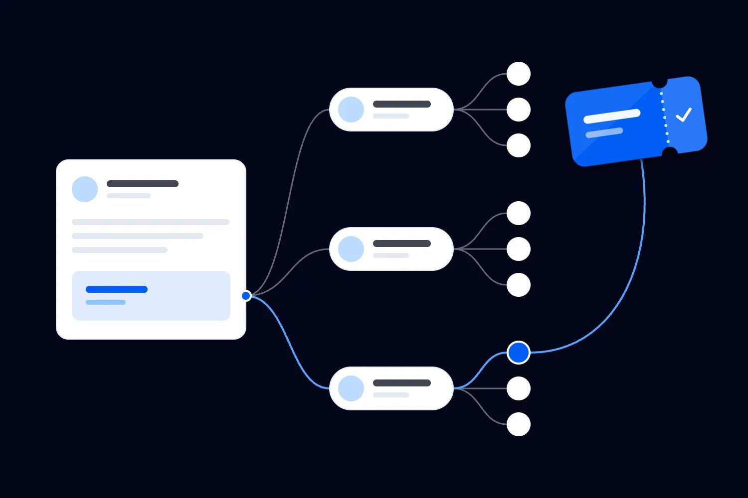
Imagine someone arriving from an advert for a specific Friday. They shouldn't have to identify that Friday again inside a generic calendar. The page they reach needs to confirm the event they clicked, including its date and venue, before asking them to buy.
Now imagine someone who already knows your series and wants to see what's next. They need an upcoming events view. And someone encountering you for the first time needs enough context to decide whether this is their kind of event. Your template must accommodate these different starting points without sending everyone through the same introduction.
Look for a homepage that can explain the series briefly and make upcoming dates obvious. Then look for a repeatable event page that can hold the detail for one edition. The navigation should help visitors move between them, using ordinary labels such as upcoming events and about the series.
You don't need a complicated menu to look established. Every extra destination needs content and a reason to exist. A large navigation copied from a conference demo can bury the date selection on a small commercial series site.
Ask a person who hasn't helped build the site to find an event they could attend. Watch where they start. If they head towards a decorative banner because the upcoming list looks secondary, you've learned something useful about the layout.
Our event landing page guide helps you decide what a booking page should communicate. Here, you're choosing whether the template gives that information the right place.
Test date selection before judging the homepage
The upcoming events area deserves more scrutiny than the opening photograph. It carries the practical choice your visitor came to make. Put your real dates into the trial and check whether a buyer can compare them without remembering information from several screens.
Each listing should make the event date and location clear. Add the distinction that matters for your series, such as the theme, performer, level, or session time. If two editions look identical but offer different experiences, a buyer needs enough information to choose before entering either page.
A list is often a good starting point when visitors mainly want the next available event. A calendar can help when the pattern of dates matters, but don't choose it simply because event websites are expected to have one. On a phone, a month full of tiny clickable squares can make a straightforward booking feel fiddly.
Filters earn their place when there are real choices to narrow. A touring series may need a location filter. A programme serving different skill levels may need a level filter. If you only have a few upcoming dates, displaying them clearly can be easier than asking people to learn controls.
Try an empty result too. If somebody selects a location with no upcoming dates, the page should explain that situation and offer a sensible next step. A blank box looks like a broken website.
Finally, check the sorting. Your nearest upcoming date should be easy to find without a buyer scrolling through old editions first. Don't assume a template's demo ordering will match your publishing routine.
Make the individual event page do its job
A useful event page lets a buyer answer their questions in a sensible order. What is this? When and where does it happen? What's included? How much will I pay? Is there anything that makes it unsuitable for me? Then they can decide whether to book.
Put the essentials where the buyer can see them before wandering into the rest of the site. A vague heading over a full screen of photography can be attractive, but it shouldn't hide the date. Nobody should need to read your founder story to find the doors time.
Load the longest event title you actually use. Add a venue with a long name. Include practical details, a price explanation, and a realistic description. Does the layout still work? Or have you started shortening important information because the demo was built around five neat words?
Check how the page handles a change. If the venue moves, can you make the update prominent without rewriting the whole layout? If ticket sales haven't opened, can you explain when they will? A countdown copied from another type of event may be meaningless for yours.
Keep shared series information available, but avoid making every event page carry everything you've ever written. Buyers need the relevant details for that edition. A clear link to the wider series is enough when the extra story isn't required for the booking decision.
Choose a template that accommodates your information. Don't let a rigid content box decide what your buyers are allowed to know.
Separate shared layout from date-specific content
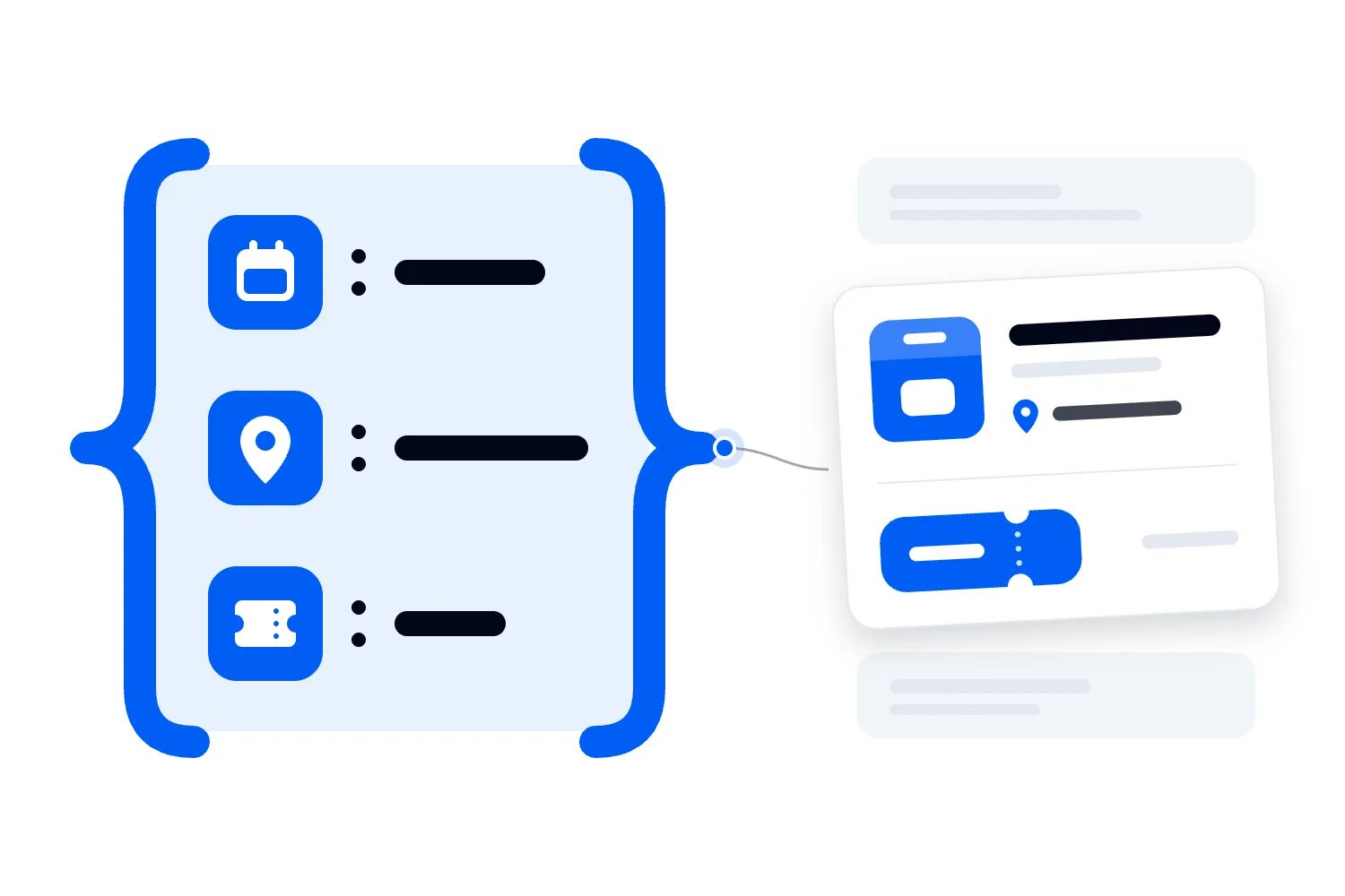
Here's what's really useful about a repeatable event page. Your team can keep a consistent reading order while changing the actual event. That only works if the website separates the layout from the information belonging to each date.
In a website editor, a template is generally a reusable layout. The exact meaning varies by system. WordPress.com's template documentation explains that its templates are shared across pages, while page content stays separate. Changing a shared template can change every page using it. That's a helpful distinction to understand before anyone starts editing.
Ask the seller or builder to show you where event information lives. Can an editor enter the date, venue, title, and ticket link in obvious places? Does the upcoming list use those entries, or do you have to repeat them manually elsewhere? A claim that something is easy to customise doesn't answer either question.
Then make a shared design change in the trial. Adjust the heading style, for example, and check whether all event pages respond as expected. After that, change one event's venue and confirm the others stay intact.
A manually duplicated page can be enough for a short series if your team understands the checking involved. A larger programme may justify a system where one event record supplies several views. The sensible choice depends on your publishing workload, not which method sounds more advanced.
The test is practical. Can the person maintaining the site explain what an edit will change before pressing publish? If they can't, keep asking until the website's behaviour is clear.
Choose a layout your ticket checkout can actually use
A ticket button in a demo is only a button. You need to know where it leads and whether the template supports the purchase experience you intend to offer. Test this before paying for customisation around an assumption.
You might send buyers to a hosted ticket page, or place a ticketing embed inside your own site. An embed is content from another service displayed within your webpage. Check that your website builder and the plan you're considering allow the required embed. A template's appearance doesn't establish that permission.
Loopyah's ticketing page confirms that you can place your event page on your website with a copy-and-paste embed. Buyers can check out as guests, and the confirmation email links to their QR tickets. Your website template still needs to present the right event and accommodate the embed properly.
Don't recreate ticket availability in a separate text box unless you have a reliable way to keep it current. A decorative price badge that stays on yesterday's release creates confusion when checkout shows something different. Let ticketing handle the ticket choice, and use surrounding website copy to explain the event.
For each date in your trial, follow its purchase button. Confirm that it opens the intended event rather than a general account page or the previous edition. Check the same route on a phone.
If you're comparing those purchase approaches, read our guide to selling event tickets on your own website. Template selection should support that decision without pretending the template itself provides ticket operations.
Treat the mobile version as the real demonstration
Open the trial on your phone with your actual event content loaded. Use it the way a buyer would while messaging a friend or checking whether the date works. A desktop preview reduced to a narrow window is useful, but it doesn't replace holding the page in your hand.
Start with the menu. Can you open it, find upcoming events, and close it without losing your place? Then read a listing and move to the date page. Look for clipped titles, oversized empty spaces, and information hidden inside controls that aren't obvious.
Check the purchase area carefully. A fixed ticket button can help on a long page, provided it doesn't cover important information or interfere with the checkout. If several fixed controls compete for space, such as a cookie notice, chat bubble, and purchase button, the page can become difficult to use.
Try the most awkward content. A long venue address is a better test than a short city name. A session with several price options tells you more than a single tidy demo price. Rotate the phone and enlarge the text to see whether the design stays usable.
Also inspect what happens when you return from checkout. Can you still tell which event you were viewing? If you tap back to compare another date, does the site leave you somewhere sensible?
Keep notes about problems a buyer actually encounters. They help you compare templates more honestly than saying one feels more modern. Your tester should know which date they want and how to buy it.
Check accessibility while you still have a choice
A template can look readable to you and still create obstacles for other buyers. Include accessibility in your shortlist test, while changing the template is easy. Don't wait until the design has absorbed your budget and every problem becomes something to work around.
Use W3C's Easy Checks as a starting point. It covers basic checks including keyboard use, text resizing, colour contrast, headings, and form labels. W3C also makes clear that passing those checks doesn't establish full accessibility. They're an initial review, not a certificate.
For your event series trial, try navigating without a mouse. Can you reach the date choices and purchase button? Can you see which control is selected? If a menu opens, can you leave it? Ask the builder to resolve failures in the template rather than assuming buyers will find another way.
Check ordinary text against its background, especially dates and small practical details. A photograph that changes between editions can make overlaid words difficult to read even when the demo looked fine. Test the actual photograph and mobile crop.
W3C's page structure guidance explains why meaningful headings and page regions help people navigate. Ask your builder to keep that structure intact. Enlarging a line of text doesn't automatically make it a useful heading for assistive technology.
Where the decision is important or the site has complex interactions, arrange a fuller accessibility review. A template seller's broad assurance is weaker than evidence about the pages and purchase route your audience will actually use.
Look at performance with your content installed
An empty template can load differently from the site you'll run. Your event photos, video, ticket embed, tracking tools, and fonts all become part of the experience. Test a realistic page before concluding that the template is fast enough.
Google's Web Vitals guidance groups performance around loading, responsiveness, and visual stability. In plain words, buyers should see useful content promptly, controls should respond when they use them, and the page shouldn't jump around as it loads. Those are more useful questions than whether the opening animation feels impressive.
Run the populated page through a performance tool, and ask whoever is building the site to explain the result in those terms. A test score isn't a promise about every buyer's experience. Check the page yourself on a phone too, especially if your normal connection is unusually fast.
Watch the date list and ticket button while the page loads. If images push them down after you start reading, that's a practical problem. If a background video has to load before the event details become clear, question what the video earns.
MDN's guidance on image performance explains using appropriate image sizes and reserving space for images so layouts don't shift while they arrive. Ask whether your chosen builder handles these jobs, and what your editor needs to do when uploading new assets.
Prefer a template that performs sensibly with your normal content. A design that only works after a developer rescues every new edition can become an expensive maintenance habit.
Ask what you can control for search
A good template should make each edition understandable on its own page. Search is one reason to check that structure, but don't accept a promise that a particular layout will put your series at the top of results.
Ask whether you can edit each page's title and description, publish a stable address for each event, and link between the series page and individual dates. Then check whether those controls belong to the template, the website builder, a paid plan, or an extra extension. You're buying the whole arrangement, even when the gallery only shows the design.
If event search visibility matters, ask how the site supplies event structured data. That's information written in a format search engines can read, describing details such as the event and its location. You don't need to write the code yourself to ask for proof that the information is correct.
Google's event structured data documentation says each event needs a unique page address for its event experience, and the page should focus on a single event. Eligibility also depends on Google's guidelines and availability. Correct markup doesn't guarantee an enhanced search result.
Keep the website's displayed details consistent with that information when an event changes. Ask who handles a postponed date or cancellation, and how they check the result.
This is a template selection question about the website you control. Don't assume a ticketing embed gives your website those search settings or that Loopyah manages your custom site's search information. Get the website provider to demonstrate the controls you'll actually use.
Test sold-out, changed, and finished dates
Your series won't stay in the neat state shown in a template gallery. Some dates will sell out. Others will finish while later events remain on sale. A venue may change. The template needs a clear way to handle those states without confusing the next buyer.
Take one trial event and mark it sold out. Can someone still see what happened and find another relevant date? If your ticketing service offers an appropriate next step, explain it accurately. Don't leave a prominent buy button that repeatedly sends people towards an unavailable purchase.
Then finish another date. Check whether it disappears from the upcoming list as intended, and whether its own page clearly describes it as past. An archive can show that your series has a history, but those old editions shouldn't compete with current sales as if they're still bookable.
For a changed event, put the correction near the relevant details. A general notice at the bottom of the homepage isn't enough when buyers arrive directly on an event page. Ask how you'll update the date listing and event page together.
Also test the quieter period between announcements. The site should still explain the series, give people a way to contact you, and say what visitors can expect next. You don't need to manufacture a ticket offer to fill space.
These trials reveal how the layout behaves after launch. The design that looks slightly less dramatic in the gallery may be the one that handles your event business properly throughout the year.
Let the future editor run the next-date test
Now hand the trial to the person who will maintain it. That may be you, someone in your team, or an outside partner. Give them the confirmed details for a new edition and ask them to publish a preview without the designer talking them through every click.
They should create the event page, enter its information, place the right ticket link or embed, and make it appear in the upcoming list. Then they should check it on a phone. Watch which parts feel straightforward and where they have to guess.
After that, ask them to change the venue and correct a typo. Can they do it without editing shared content accidentally? Can they preview the result before it goes live? Can they recover if they make the wrong change? The answers tell you about the working website, rather than the salesperson's demonstration.
Record the steps they had to repeat. If publishing one date means editing the homepage, a calendar, a page banner, and a footer manually, that may still be manageable. But price the checking work honestly and understand what can get out of sync.
Don't use the trial to judge the editor's technical confidence. Use it to judge whether the tool suits the person doing the work. A beautiful site maintained only by the original designer may be an acceptable arrangement if you've agreed availability and cost. It's a poor surprise to discover during an urgent event change.
Pick the template your actual team can keep accurate under ordinary working conditions.
Compare the whole cost before making the decision
The template price is one part of the cost. You may also need a website plan, domain, setup help, extra functions, and ongoing support. Ask for a clear description of what's included and what you would pay separately before comparing options.
Keep the comparison grounded in your series. If you need an embed, price the plan that allows it. If you need several editors, ask what access costs and what each person can change. If the design needs custom work to show upcoming dates properly, include that work rather than treating it as a detail to solve later.
Ask about the costs of ordinary changes. Replacing a photograph and adding an edition should be routine. Changing the design of every event page may be a separate job. Decide which kind of help you're buying so neither side has to negotiate a small emergency while tickets are on sale.
Think about leaving too. Can you keep your domain? Can you get your event content out? Who owns the account and the customised work? A template can be inexpensive to adopt and inconvenient to replace if those questions stay unanswered.
Use quoted costs and your team's own experience rather than a generic claim about what a website should cost. If an option saves editing time, measure that during the trial. Don't give it imaginary financial benefits because the description sounds efficient.
The best value is the template that meets your needs with a maintenance arrangement you can afford. Sometimes that's a modest layout with clear support. Sometimes paying more removes a specific, recurring job.
Send a trial brief before asking for a recommendation
Give each provider the same short brief so their recommendation answers your situation. Explain the type of paid series, who maintains the website, and which event details change. Attach real copy and the ticket route you intend to use. Ask them to show the chosen template with that material, rather than describing what somebody could eventually build.
Use a concrete request. You want to see a visitor choosing between upcoming dates, opening a specific edition, reading its practical details, and reaching checkout. You also want your editor to create another edition and correct its venue without affecting the rest of the site.
Ask what comes with the template and what needs separate setup. For every extra function, request its price, the required website plan, and the person responsible for maintaining it. If the answer depends on custom work, get the scope in writing before treating that function as available.
Keep the questions focused on demonstrations. Can you show this event title on a phone? Can our editor change this ticket link? What happens to this listing after its date passes? Ask the provider to show each answer in the working preview.
Finally, ask which limitations they would expect your team to encounter. A provider who explains a constraint gives you something useful to evaluate. An answer that everything is possible leaves you guessing about the cost and effort of making it happen. Ask who will help your editor if a correction is needed while tickets are selling.
Make a decision you can explain to your team
Before buying, put your shortlist through the same trial. Use the same dates, descriptions, photographs, and ticket routes. Otherwise you're comparing one template's polished demonstration against another one's unfinished setup, which tells you very little.
Set your requirements before scoring appearances. A wrong checkout destination, an unusable mobile menu, or an editor who can't publish the next edition should stop the decision until someone proves the problem can be fixed. Don't average those failures away because the header looks good.
Among the options that pass, choose the one that presents your series well and asks the least unnecessary work of your team. Be specific about any remaining compromise. Perhaps the archive is basic but adequate. Perhaps you need paid setup help, followed by editing your team can handle themselves.
Keep the plan, support contact, account owner, and publishing checks in one handover note. Include outstanding fixes, who will complete it, and when. Someone taking over later should know which details they can change themselves and when they need to call for help with the website.
You can then make the design your own with the people responsible for it. The template has already earned its place by handling the booking and publishing jobs. Colours and photography can build recognition around a structure you trust.
Choose the website template that lets a buyer book the right edition and lets your team publish the next one confidently. Put real event content into the trial, follow the purchase route, and make the future editor use it. That's how you find the design your series can actually live with.

Author: By the Loopyah Content Team
The Loopyah Content Team shares expert insights, practical guides, and industry updates to help event organizers create unforgettable experiences and stay ahead in the event planning world.