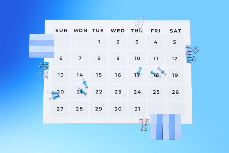
Event Program Template: How To Create A Flawless Program
A great event feels effortless from an attendee’s point of view: they always know what’s happening, where to go, and how to get involved. Behind the scenes, that clarity doesn’t happen by accident—it’s driven by a well‑structured event program. The fastest way to deliver that clarity every single time is to standardize your Event Program Template and make it a reusable, team‑ready asset.
In fact, research on project performance shows that teams using flexible, well‑structured practices consistently outperform peers across predictive, hybrid, and agile approaches. Treat your event program like a project deliverable and lock it into a repeatable template—you’ll reduce variance, speed up production, and cut down on day‑of surprises. (PMI)
In this guide, we’ll walk through what an Event Program Template includes, why it pays off, and how to build one that works across print, PDF, and mobile/app formats. You’ll get examples, customization tips, common pitfalls to avoid, and a downloadable template framework you can plug into your next event.
What Is an Event Program Template?
An Event Program Template is a structured, reusable layout (print and/or digital) that organizes everything your attendees need to know—schedule, sessions, speakers, sponsors, maps, and logistics—into a single, scannable source of truth. Instead of rebuilding from scratch for each event, you start 70% done with a master file that your team updates with event‑specific details.
Its purpose is twofold: to make planning frictionless for your team and to deliver a consistent, on‑brand experience for your audience across touchpoints (PDF, app, signage, emails). By templating the structure, typography, and brand elements, you reduce errors and ensure the program is useful under real‑world, time‑pressured conditions.
Key components your template should include:
Event schedule (at‑a‑glance, daily view, and detailed breakdown)
Session descriptions (titles, formats, goals, prerequisites)
Speaker bios (names, roles, headshots, social handles)
Sponsor information (tiers, logos, benefits, CTAs)
Venue map (rooms, wayfinding, accessibility, QR code to interactive map)
Contact information (help desk, emergency, lost & found, code of conduct)
For deeper planning context, see our breakdown of building a clean, scannable event agenda. Pairing a strong agenda with an Event Program Template gives attendees both the big picture and the details they need.
Benefits of Using an Event Program Template
An Event Program Template isn’t just a design convenience—it’s operational leverage. Here’s what you gain:
Time‑saving: Spin up the program in hours instead of days by dropping content into predefined sections and styles.
Consistency: Deliver the same polished look and feel across editions and channels, strengthening brand trust and recognition. Research on commerce experiences has shown that consistent, positive experiences correlate with higher spending—your program is part of that consistency story.
Organization: A standardized information architecture (IA) makes navigation effortless—less hunting, fewer questions at the help desk.
Professionalism: A clean, accessible layout elevates the perceived quality of your event and sponsors.
Easy updates: Because the template accounts for real‑time changes and versioning, you can push updates without breaking design or hierarchy (especially important for multi‑day conferences).
Key Elements of an Effective Event Program
A flawless program balances clarity, design, and interactivity. Build these elements into your master template:
1. Clear Schedule
Make your schedule scannable at a glance. Use a clear hierarchy: day tabs, time blocks, track labels, and room identifiers. Limit line length to roughly 50–75 characters and keep ample line spacing to improve readability in dense, multi‑track schedules. For multi‑track events, provide a filterable view (by track, format, level) and a simple personal “star to save” interaction in the digital version.
2. Engaging Content
Write benefit‑led session descriptions. Front‑load what matters: who it’s for, what you’ll learn, and why it’s worth attending. Keep titles short and meaningful; avoid insider jargon unless your audience uses it daily. Speaker bios should spotlight credibility without turning into walls of text—aim for 40–60 word bios with one human detail (a recent project or fun fact) to build connection.
3. Visual Appeal
Good design is a usability feature. Bake in a consistent grid, typography tokens (sizes, weights, spacing), and color contrast ratios that meet accessibility guidelines. Reserve white space so content can breathe. Define standard placements for sponsor logos that look premium rather than crowded.
4. Accessibility
Plan for accessibility from day one. WCAG 2.2 adds criteria that directly affect digital programs: help consistency, accessible authentication, redundant entry, and focus indicators. Template your heading structure (H1–H4), link text (“View venue map” instead of “Click here”), color contrast, and focus order to meet WCAG 2.2 AA.
See the WCAG 2.2 overview for details and include an accessibility QC pass in your pre‑launch checklist.
5. Call to Action
Every section of your program should invite action: “Add to schedule,” “Ask a question,” “Visit this booth,” “Book a meeting,” “Share your feedback.” Keep CTAs concise, benefit‑led, and visually consistent. Personalization can dramatically lift engagement (e.g., “Save this workshop to your agenda, Sam”). Standardize one primary CTA per screen/section to reduce decision fatigue.
6. Maps and Wayfinding
Include a clean venue map and clear signage references. Pair the printed map with a QR code that opens an interactive version for turn‑by‑turn directions, ADA routes, and restroom/food stations. For physical wayfinding strategy, explore these event signage ideas to align your on‑site experience with your program.
How to Create an Event Program Template
Follow these steps to build a template your team can clone and customize for any event type.
1. Define the Event’s Purpose
Align on goals and audience outcomes before you design a single page. Are you educating, entertaining, fundraising, or launching? The purpose drives program structure—e.g., a conference might prioritize track filters, while a gala emphasizes a linear timeline and sponsor recognition.
2. Gather Essential Information
Collect schedules, session abstracts, speaker bios, sponsor tiers, venue details, accessibility accommodations, and contacts. Decide upfront what metadata you’ll include for sessions (format, level, room, capacity, prerequisites) and standardize it in your content intake forms.
3. Choose a Design Layout
Match the layout to your event type: multi‑track grid (conference), timeline (gala/ceremony), or module stack (workshops/retreats). Lock your grid, spacing, and typographic scale once, so updates never break the hierarchy. If you print booklets, set your template with correct margins, bleeds, and imposition settings. If you deliver mobile/app first, design responsively and test tap targets and contrast.
4. Incorporate Branding Elements
Bake your brand kit into the template: logo lockups, color palette, typography, and sponsor placement rules. Maintain these as tokens/styles, not manual overrides, so collaborators can’t drift off‑brand.
5. Create Sections for Each Element
Build out standard sections: Welcome note, At‑a‑glance schedule, Daily details, Sessions and tracks, Speaker bios, Sponsor gallery, Venue map, Accessibility & amenities, House rules/code of conduct, Contacts & help. Keep a consistent heading structure (H2 for sections, H3 for sub‑sections) to support both scanning and screen readers.
6. Add Placeholder Content
Use labeled placeholders and examples to guide contributors: [Session title—benefit‑led], [Speaker name—role—45‑word bio], [Sponsor tier—logo 600×300 px]. Include QR code placeholders (map, live Q&A, feedback). Pre‑write CTAs like “Add to schedule” and “Visit booth A12” so they’re consistently styled.
7. Review and Refine
Run a cross‑functional review: design, operations, programming, accessibility, and sponsorship. Proofread bios and titles. Spot‑check line lengths and contrast. Test on mobile and print a sample booklet. Do a “fresh eyes” pass with someone new to the event—can they find rooms, breaks, and keynotes in 10 seconds?
Tips for Customizing Your Event Program Template
Understand Your Audience
Tailor labels and descriptions to how your audience actually talks. Front‑load what matters most to them—outcomes, level (beginner/advanced), and formats (talk vs. hands‑on). If you serve multiple personas, use filters and color coding for tracks (e.g., Developer, Marketer, Ops) and make the legend obvious.
Incorporate Interactive Elements
Add QR codes for venue maps, speaker slides, live polls/Q&A, and post‑session surveys—scanning is now second nature for most attendees. In the digital program, elevate CTAs like “Add to calendar,” “Ask the speaker,” and “Visit sponsor microsite”.
Optimize for Mobile
Design mobile‑first. Test legibility at arm’s length, enforce minimum tap targets, and avoid tiny tables that require pinch‑zoom gymnastics. Offer an offline‑friendly PDF as a fallback and an app/HTML version for real‑time updates. Keep file sizes light—your attendees may be on spotty Wi‑Fi.
Gather Feedback
Bake feedback into the program with quick links and QR codes: “Rate this session,” “Suggest a topic,” “Report an issue.” After the event, close the loop with smart emails. If you need ideas, browse our post‑event survey questions and event email marketing strategy guides.
How to Share and Distribute Your Event Program
Creating a great event program is only half the job—the other half is making sure attendees can actually find and use it. Distribution should be intentional, multi-channel, and timed to meet attendees where they are: before, during, and after the event.
1. Pre-Event: Get It in Their Hands Early
Share your program the moment your schedule and speakers are confirmed. Early access helps attendees plan travel, sessions, and networking.
Best practices:
Email launch: Send a “Program Now Live” announcement with links to the digital version and a downloadable PDF.
Event website: Feature your program prominently on the homepage and agenda page with a clear CTA (“View Full Program”).
Registration confirmation: Embed the program link or QR code directly into confirmation emails so every registrant gets it automatically.
Social channels: Post teasers highlighting key sessions, speakers, and behind-the-scenes prep, always linking back to the full program.
2. On-Site: Make Access Effortless
Once attendees arrive, they should be able to access the program instantly—no searching, no guessing.
Tactics that work:
QR codes everywhere: Place scannable codes on signage, badges, and tables linking to the live digital program.
Event app integration: Embed the program within your event app for real-time updates, personalized schedules, and notifications.
Printed booklets or foldouts: For high-touch or formal events, keep compact printed versions at registration, info desks, and sponsor booths.
Help desk visibility: Train staff to point attendees to both print and digital versions when answering questions.
3. Real-Time Updates and Push Notifications
If your schedule changes, push the updates where attendees are already looking.
Smart update channels:
In-app notifications for session or room changes.
On-site digital signage that refreshes live.
Email or SMS alerts for major shifts (like keynote time changes).
4. Post-Event: Keep It Working for You
Your event program can live on as content, not just a one-time artifact.
Repurpose ideas:
Publish a post-event “Highlights” version with photos, session recordings, and sponsor thanks.
Link to the archived program in your event recap email.
Use engagement data (clicks, downloads, most-viewed sessions) to refine your next event’s template.
Event Program Template Checklist
Before you lock your template and hand it off to the team, run through this checklist to make sure every element is built for clarity, accessibility, and reusability. A strong event program template should be as reliable as your registration system—ready to perform flawlessly for any event type.
✅ Structure & Layout
Clear hierarchy of headings (H1, H2, H3) for sections like schedule, speakers, sponsors, and map
Logical flow from welcome → overview → daily details → closing
Consistent margins, grid, and spacing for both print and digital formats
Responsive design tested on desktop and mobile
✅ Content Components
At-a-glance schedule and detailed daily breakdown
Session titles, times, formats, and learning outcomes
Speaker bios with names, photos, and contact/social links
Sponsor tiers with logos, benefits, and links
Venue map and wayfinding information (with QR to interactive version)
Contact and help desk details (emergency, lost & found, accessibility support)
Code of conduct and event policies
✅ Branding & Design
Brand colors, logo lockups, and typography baked into the master template
Sponsor placements aligned to brand guidelines (avoid visual clutter)
High-contrast color ratios (meets WCAG 2.2 AA accessibility standards)
Consistent iconography and spacing for a polished visual rhythm
✅ Accessibility & Usability
Descriptive link text (“View schedule,” not “Click here”)
Alt text for all images and maps
Keyboard navigation and readable tab order
Minimum 4.5:1 color contrast ratio for text and background
Test screen reader compatibility before launch
✅ Interactivity & Calls to Action
“Add to schedule,” “Ask a question,” and “Visit sponsor” CTAs clearly visible
QR codes for maps, slides, or feedback forms tested and functional
Personalization tags (e.g., “Save this session, Alex”) configured in digital templates
✅ Version Control & Distribution
Single source of truth for all edits (CMS or event management platform)
Clear naming conventions for file versions and exports (print vs. digital)
Export presets saved for PDF, print, and HTML formats
Tested download links and app integrations
Tools and Resources for Creating Event Programs
Pick a design stack that fits your outputs (print booklet vs. responsive digital) and standardize across the team. Here are solid options:
Canva: Fast, collaborative, and ideal for lean teams; plenty of program templates you can lock down with a brand kit.
Adobe InDesign: Professional control for complex layouts and booklet printing (saddle stitch or perfect bound).
Microsoft Word: Surprisingly capable for basic booklet programs with built‑in templates.
Event management software: Centralize schedules, speakers, and attendee communications. Loopyah’s event software keeps your program in sync with registration, seat maps, and emails to attendees.
Production Notes: Print vs. Digital
If you’re printing booklets, finalize specs in the template: trim, bleeds, safe margins, page count estimates, and imposition. For digital, standardize responsive breakpoints, alt text patterns, and link styles. In both cases, save export presets (PDF/X for print; optimized PDF/HTML for digital) so nobody has to guess at the settings.
Common Mistakes to Avoid
Avoid these pitfalls when building and populating your Event Program Template:
Overcrowding information: Dense walls of text reduce scanning. Break up content with headings, bullets, and ample white space.
Poor hierarchy: Inconsistent heading levels and styles confuse readers. Template your heading scale and stick to it.
Ignoring mobile users: If it’s unreadable on a phone, it’s unusable on site. Always test mobile first.
Lack of branding: Ad‑hoc colors and fonts weaken credibility. Lock brand tokens in your template.
Not proofreading: Typos in names, titles, or rooms erode trust fast. Institute a multi‑person review loop and sign‑off checklist.
Skipping accessibility: Low contrast, vague links, and poor focus order block users. Build WCAG 2.2 AA into your template and QC process.
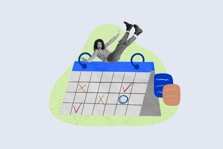
Turn Your Template Into a Repeatable System
A flawless event doesn’t happen by luck—it’s built on repeatable structure, shared standards, and clear communication. Your event program template is more than a design file; it’s a framework that keeps every department—marketing, operations, sponsors, and speakers—aligned around one consistent attendee experience.
By standardizing your layout, accessibility rules, and content workflow, you eliminate chaos and elevate quality. Each new event starts from a proven foundation instead of a blank page, saving hours and reducing stress while ensuring your brand looks polished across every channel.
Use Our Event Program Template
The next step? Make your template a living asset. Store it in your event management system, update it after every event, and treat it like your playbook for excellence. Over time, it will evolve into one of your team’s most valuable productivity tools—helping you launch events faster, communicate clearer, and deliver a premium experience every single time.
Ready to put it into action? Download our editable Event Program Template and start building your next flawless event today.
Download TemplateAuthor: By the Loopyah Content Team
The Loopyah Content Team shares expert insights, practical guides, and industry updates to help event organizers create unforgettable experiences and stay ahead in the event planning world.