Venue Space Psychology: Why Not All Venues Are Created Equal
Some venues feel electric the moment you walk in. Others feel… off. Same city, same type of event, wildly different vibes. That’s not an accident. It’s space psychology at work.
Venue space psychology is about how your physical space quietly tells people how to feel, where to go, and what to do. The colors on the walls, the way sound bounces (or doesn’t), how bright the room is, where the chairs sit, even what’s hanging from the ceiling—these are not just “design choices.” They are behavioral nudges.
In Loopyah’s Event Attendee US 2025–2026 study, 62.6% of event goers named overcrowding as a top negative experience. That’s not purely a “too many tickets” problem. It’s also a space problem—layout, wayfinding, and how you manage flow.
If you plan events or manage venues, understanding venue space psychology is one of the fastest ways to boost satisfaction, repeat visits, and spend—without adding a single headliner.
Let’s break down what actually makes people love some venues and avoid others—and how you can use those same principles in your own space.
What Is Venue Space Psychology?
Venue space psychology is the study of how the physical environment of a venue affects how people feel, think, move, and interact inside it.
Think of your venue as a script. It tells people:
Where to go next (or where not to go at all).
Whether they should relax, focus, mingle, or leave.
If this experience feels premium, chaotic, or forgettable.
The main building blocks of venue space psychology are:
Color – sets emotional tone and perceived energy.
Lighting – shapes mood, alertness, intimacy, and attention.
Acoustics – controls comfort, fatigue, and how easily people can talk or listen.
Layout – directs traffic, interaction, and engagement levels.
Décor – signals brand, quality, and the type of experience to expect.
Research in environmental psychology shows that specific design features—color, complexity, biophilic elements, symmetry—consistently predict emotional responses. That means you can design your venue to reliably encourage calm, excitement, focus, or connection instead of leaving it to chance.
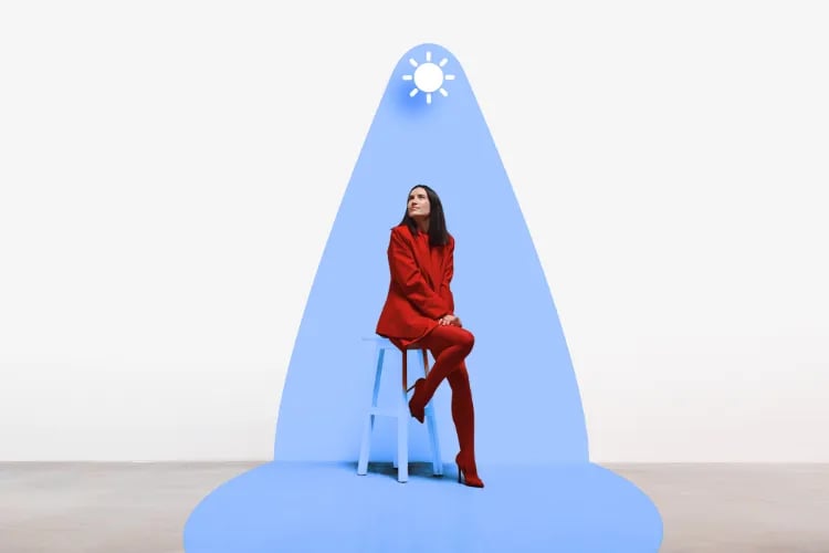
The Impact of Color
Color is one of the fastest ways to change how a venue feels, even if you don’t touch the layout. A massive body of research links colors to specific emotional responses. Lightness and saturation matter just as much as hue—brighter, more saturated colors typically feel more energetic; lighter tones read as more positive.
Here’s how the main color families typically land in venue space psychology.
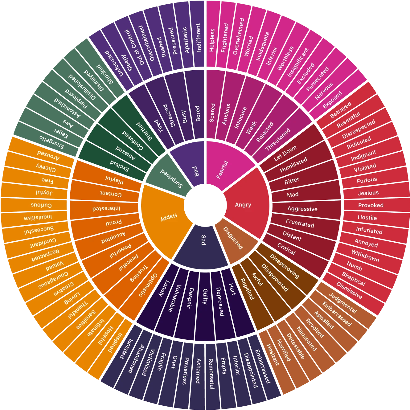
Source: Feelings Wheel
Blue: Calm, Trust, and Focus
Blue is associated with calm, trust, and professionalism. Studies on interior environments show that blue can support cognitive control and sustained attention—great for conferences, learning zones, and tech-heavy events.
Use blue when you want attendees to feel:
Grounded and safe (think registration or help desks).
Ready to learn and focus (plenary rooms, breakout stages).
That they can trust the brand behind the event.
Green: Nature, Balance, and Recovery
Green is tied to nature, balance, and restoration. Biophilic design research (plants, natural textures, outdoor views) shows measurable reductions in stress and improvements in mood.
Use green when you want to:
Create recovery zones where people can reset between sessions.
Make wellness, sustainability, or community themes feel authentic.
Soften industrial or techy spaces without fighting the architecture.
Yellow: Energy, Optimism, and Attention
Yellow is bright, optimistic, and attention-grabbing. In small doses, it lifts energy and makes spaces feel lively. In large doses, or at high saturation, it can feel aggressive or tiring.
Use yellow for:
Highlighting key wayfinding points or interactive areas.
Short-burst high-energy zones—photo walls, merch corners, activations.
Just don’t drown a whole ballroom in saturated yellow unless your goal is “eye strain.”
Red: Excitement and Urgency (Use with Care)
Red is powerful: exciting, passionate, and urgent. It raises arousal and attention, which can be great for short, high-intensity moments but quickly becomes overwhelming.
Use red strategically:
For impactful entrances, countdown moments, or key stage reveals.
In signage for important actions—“Check-in here”, “VIP entrance”, “Emergency exit”.
Avoid bathing entire seating areas in strong red light for long sessions unless you want people restless and fatigued.
Neutrals: Clean, Flexible, and Brand-Friendly
White, gray, and beige get a bad rap as “boring,” but they’re your best friends for flexibility. Neutrals:
Make spaces feel larger and cleaner when done well.
Let brand colors, lighting, and décor pop without visual chaos.
Work across multiple event types—corporate, weddings, concerts, community.
If you run a multi-use venue, neutral base + controlled color accents is usually the smartest move.
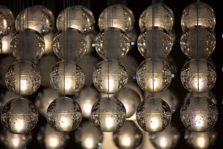
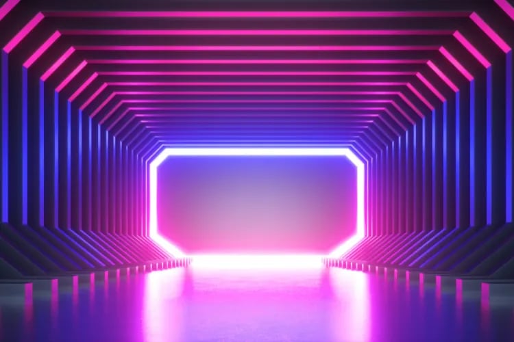
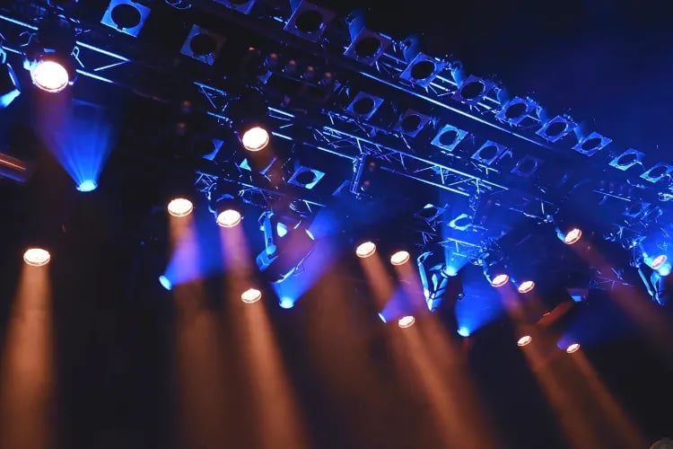
The Role of Lighting
If color is the paint, lighting is the dimmer switch for emotion. It changes how colors read, how big or small a room feels, and how awake or relaxed people are.
Modern standards like the WELL Building Standard emphasize not just “enough light,” but the right type of light to support mood and circadian rhythms.
Key types of lighting and how they land in venue space psychology:
Natural Light: Energy and Trust
Daylight is almost always a win. It boosts alertness, supports healthy sleep cycles, and makes spaces feel more honest and open.
Use natural light for:
Morning registrations and networking.
Learning-heavy sections of your program.
Showcasing products or experiences that rely on true color rendering (food, fashion, art).
The main risk with natural light is glare. Use blinds, films, or sheer curtains to soften it when needed.
Warm Light: Cozy, Intimate, and Social
Warm light (think candlelight or a sunset glow) makes spaces feel welcoming, relaxed, and intimate. Perfect for receptions, lounges, and sponsor dinners.
Use warm, dimmer scenes when:
You want people to open up and network.
Food and drink are the heroes and you want them to look great.
Just keep pathways and stairs bright enough for safety—you can layer focused light for circulation while keeping seating areas softer.
Cool Light: Focus and Modern Vibes
Cooler, bluer light feels crisp, alert, and modern. Short exposures to blue-enriched light have been shown to increase alertness—handy for early-morning sessions or content-heavy keynotes.
Use cooler light when:
You want attendees to stay awake and focused on speakers or demos.
You’re designing for a tech-forward, minimalist, or futuristic brand.
Don’t lock a full-day event into harsh, cool lighting. Shift toward warmer scenes later in the day as attention naturally drops.
Dim Light: Intimate, Creative, and… Risky
Slightly dimmer light can increase feelings of intimacy and even support creative thinking—but go too dim and people feel tired, disengaged, or physically unsafe.
Use dimmer scenes for:
Brainstorm lounges, VIP areas, or late-night after-parties.
Moments when the stage should own almost all the attention.
Keep check-in, bars, and circulation areas brighter so guests can see faces, read signage, and feel secure.
Acoustics and Sound
Sound is one of the fastest ways to ruin an otherwise beautiful venue. If people can’t hear, can’t talk, or leave hoarse and tired, they won’t care how nice the chandeliers are.
Our event attendee study shows overcrowding and expensive F&B as top complaints, but acoustics are right behind in real-life feedback: too loud to talk, too echoey to understand speakers, or dead zones where the audio disappears.
In hospitality-style settings, research suggests that background noise above roughly 50–55 dB(A) starts to force people to raise their voices. That means more fatigue and less desire to stay longer or order more.
What Good Acoustics Feel Like
Good acoustic design doesn’t mean “silent.” It means:
You can hear the speaker clearly from almost any seat.
You can have a conversation at a reception without shouting.
There are no “hot spots” that are painfully loud or “dead spots” that feel disconnected.
Speech that’s too loud, too reverberant, or competing with music is mentally exhausting. Control that, and people stay longer and feel better about your event.
Tools to Manage Sound
You don’t need a full renovation to improve acoustics. Start with:
**Sound-absorbing materials** – acoustic ceiling tiles, fabric wall panels, curtains, rugs, upholstered furniture. These reduce echo and overall noise levels.
**Acoustic panels and diffusers** – shape how sound travels so it doesn’t bounce straight back at listeners or pool in corners.
**Sound masking systems** – low-level background noise (like soft airflow) that makes speech less intrusive in lobbies, registration, and lounges.
During planning, walk your space like an attendee. Stand where they’ll queue, mingle, and sit. If you can’t carry a normal conversation or clearly catch a sentence from the stage, neither can they.
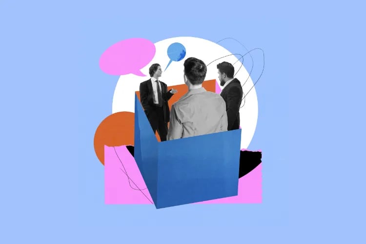
Layout and Spatial Arrangement
Layout is where venue space psychology becomes very real, very fast. A gorgeous room with a bad layout feels crowded, confusing, and stressful. A modest room with a smart layout feels smooth and intentionally designed.
In our attendee data, overcrowding was the number-one on-site pain point. Many times, it’s not purely about capacity—it’s about how you use the space.
Open Layouts: Social Energy and Buzz
Open layouts are great for expos, trade shows, and networking-heavy events. They create visual energy and make it easy to see what’s happening.
Pros:
Encourage chance encounters and casual conversations.
Let attendees visually scan options (booths, stages, activations).
Cons:
Can get noisy and feel overcrowded fast.
Harder to create privacy for focused meetings or demos.
Closed Layouts: Focus and Privacy
Closed layouts use more walls, partitions, or enclosed rooms. They’re great for training, confidential meetings, or performances that require strong attention.
Pros:
Stronger control over sound and light.
Attendees feel more secure sharing, learning, or negotiating.
Cons:
Can feel cramped or maze-like if wayfinding is poor.
Harder to maintain a sense of “event-wide” energy.
Flexible Layouts: Best of Both Worlds
Most modern venues lean toward flexibility: movable walls, modular seating, and zones that can switch from keynote to workshop to gala in a day.
If you’re designing or refreshing a space, flexibility is your safety net. Programs change. Clients change. Having furniture and infrastructure that can pivot with them is gold.
For deep dives on how layout interacts with operations, check our guide on event logistics and overall event venues strategy.
Wayfinding: Let the Space Do the Talking
Good layout isn’t just where things are; it’s how obvious that is to your attendees. Research on “strategic visibility” shows that when stairs, exits, and key decision points are in clear sightlines, people navigate faster and feel less stressed.
Practical moves:
Place registration, main stages, and key attractions where people naturally look when they enter.
Use high-contrast, well-lit signs at decision points, not randomly in the middle of walls.
Avoid bottlenecks near doors, bars, and restrooms—these are already high-traffic zones.
We go deeper on visual guidance and visitor flow in our post on event signage ideas.
Décor and Aesthetics
Décor is where your venue’s personality shows up. It’s also where many teams overspend on pretty things that fight against the actual experience they want to create.
From a space psychology angle, décor should do three things:
Reinforce the emotional tone you’re aiming for (calm, luxe, playful, rebellious).
Signal your brand values clearly and consistently.
Support function—acoustics, wayfinding, comfort—not fight it.
Designing for Different Psychological Goals
Here’s how décor choices support different vibes:
**Luxury** – rich, saturated colors (navy, emerald, burgundy), plush materials (velvet, leather), metallic accents, symmetry, and weighty furniture. Lighting is layered but controlled.
**Comfort** – warm tones, lots of textiles, plants, varied seating (sofas, armchairs, stools), softer lighting, and visible textures like wood and woven fabrics.
**Excitement** – bold color accents, dynamic shapes, branded murals or LED walls, high contrast, and eye-catching focal points.
Whatever you pick, make sure the décor doesn’t contradict your ticket promise. A “premium” VIP package inside a venue with cheap folding chairs and harsh lighting feels like a lie, no matter how good the lineup is.
With that said, let's look at real examples of venues, why they work and we can learn and adopt from them.
Example 1: Sketch London — The Glade
The Glade at Sketch London is a masterclass in immersive design — the kind of venue that doesn’t just host people, it transports them. This room leans hard into biophilic psychology, and it pays off instantly. The hanging greenery, soft fairy-lit canopy, and hand-painted forest walls pull guests into a world that feels part enchanted woodland, part couture cocktail lounge. That blend is powerful: research shows that natural textures and organic patterns reliably reduce stress and elevate mood, which is exactly why people walk into The Glade and unconsciously exhale.
Lighting is doing subtle but important work here too. Cool-toned overhead greens mixed with warm bar lighting create a dual-focus effect — relaxed, dreamy ambience up high, sharper visual clarity where guests interact, order, and connect. It’s the perfect example of how layered lighting guides behavior without shouting for attention.
The layout keeps things intimate. Low tables, soft seating, and a bar that glows like a jewel box create clear zones: linger here, sip here, drift over there. Nothing feels crowded or chaotic, even when the room is busy — a big win considering 62.6% of event goers say overcrowding kills their experience.
The Glade succeeds because it’s not themed; it’s theatrical. Every design choice works together to shift mood, pace, and expectation. You’re not just grabbing a drink — you’re stepping into a story, and the space makes you feel it instantly.
Example 2: Meow Wold, Santa Fe, USA
Meow Wolf doesn’t just design venues — they build alternate realities. This space is a perfect example of how environmental psychology can crank immersion to maximum and give attendees permission to play. From the oversized Victorian façade to the explosive color palette and surreal performers, every element is engineered to break the “normal world” frame the moment guests walk in.
Color psychology is doing heavy lifting here. Bright, high-saturation tones like neon yellow, hot pink, and electric pastels instantly spike energy and curiosity. These colors activate excitement and exploration — exactly what you want in an experiential environment where discovery is the whole point. Pair that with contrasting architectural greens and Victorian detailing, and your brain gets a delightful jolt: familiar structure, unfamiliar universe.
The layout supports that sense of adventure. Instead of straight paths and obvious destinations, Meow Wolf leans into layered sightlines, hidden corners, and “What’s behind that door?” moments. It taps into the same principle that makes non-linear museums and theme parks so intoxicating — autonomy. Attendees get to choose their own flow, not follow a prescribed one.
Lighting adds the final nudge. Warm window glows and unexpected color washes make the set feel alive, like the house itself is part of the story. It’s playful, eerie, and inviting all at once.
This is the opposite of passive attendance. Meow Wolf designs for agency, emotion, and sensory stimulation — the trifecta that turns a venue into a world people can’t stop talking about.
Case Studies: Successful Venue Transformations
Let’s look at how applying venue space psychology in the real world can transform how people experience a space.
1. Sydney Opera House Concert Hall: Fixing the Invisible Problem (Sound)
When the Sydney Opera House upgraded its Concert Hall in 2022, the building was already iconic. The problem wasn’t how it looked—it was how it sounded.
Audiences and performers had long complained about inconsistent acoustics: some seats were too loud, others too quiet, and amplified events were hard to mix. The venue invested in a major acoustic redesign: new reflectors (“petals”) over the stage, wall diffusion panels, and adjustable drapes to tune reverberation for different types of performances.
The result? Reviews used words like “miracle” and “better than we dared imagine.” Clarity improved across the hall, amplified events sounded more balanced, and the space became dramatically more flexible—without changing the iconic look.
Space psychology takeaway: you can’t Instagram acoustics, but attendees feel them. Fixing sound can completely reset how people talk about your venue.
To learn more about performance-focused design, WELL’s guidance on circadian and visual lighting is a useful blueprint for thinking holistically about comfort, light, and time of day in event spaces.
2. A Generic Conference Hotel Turned Experience Hub
Now a composite example from several venues we’ve seen up close:
A mid-range conference hotel struggled with low repeat bookings for business events. Feedback was consistent: “bland”, “confusing layout”, “too loud in the lobby, too dead in the ballroom.”
They didn’t gut the building. Instead, they tackled venue space psychology piece by piece:
**Color** – shifted from sickly beige walls to a neutral base with deep blue accents in conference areas to signal focus and professionalism.
**Lighting** – added tunable LEDs so rooms could be bright and cool for keynotes, warmer and dimmer for networking and dinners.
**Acoustics** – installed fabric wall panels in the pre-function area and swapped hard chairs for upholstered seating to soak up lobby noise.
**Layout** – removed a central bar that created a traffic jam, added clearer sightlines to the ballrooms, and reoriented signage to face arriving guests.
**Décor** – introduced plants, varied seating clusters, and consistent visual branding so the lobby felt like a destination, not a corridor.
Within a year, NPS scores on “venue atmosphere” and “ease of navigation” rose sharply, and the hotel saw more multi-year event contracts. Nothing magical—just smart, psychology-informed tweaks.
People don’t just attend your event; they enter your world. Your venue design decides what that world feels like.
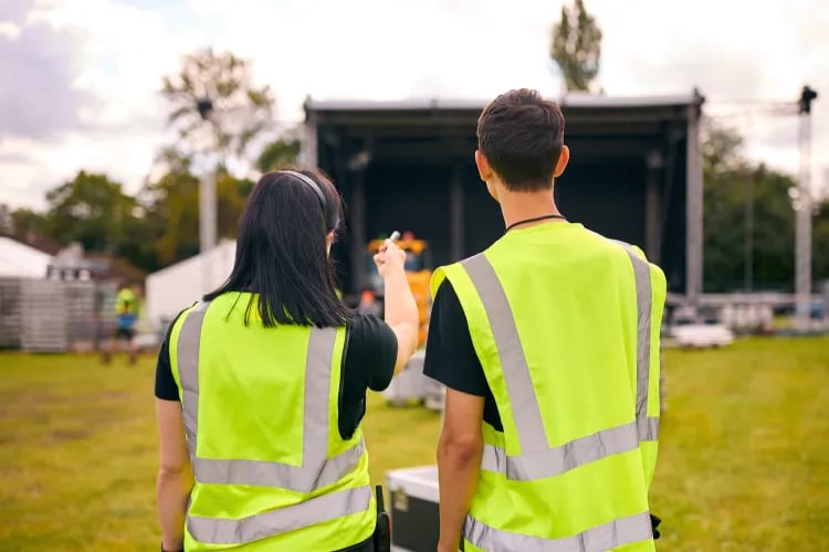
Practical Tips for Event Planners and Venue Managers
You don’t need a PhD in environmental psychology to use this stuff. Here’s how to apply venue space psychology step by step.
1. Start with Your Audience and Goals
Ask two simple questions:
Who is this event really for? (Age, interests, accessibility needs, energy levels.)
What do we need them to do at each stage of the event? (Learn, buy, meet, celebrate, perform?)
Then map your space to those goals. For example:
Learning-heavy conference morning: cooler, brighter light; blue/neutral palette; tight sightlines to stage; low noise.
Afternoon networking: warmer light; more mixed seating; music at a level where people can still talk comfortably.
Evening celebration: bold accent colors; dynamic lighting; higher energy sound while keeping some quiet pockets.
For more mindset shifts like this, have a look at our piece on the event creator mindset. It pairs well with space psychology.
2. Use Color Intentionally, Not Randomly
Pick a small palette and stick to it across walls, signage, lighting, and décor. A simple rule:
Base: neutral (white, gray, beige) to keep the space flexible.
Primary: 1–2 brand colors that match your emotional goal (blue/green for trust/calm, yellow/red for energy in short bursts).
Accent: one bolder color for call-to-action spots—registration, photo ops, merch.
If your venue runs very different event types, keep the permanent colors neutral and use lighting and removable décor to shift the mood event by event.
3. Plan Lighting as a Timeline
Don’t just set one lighting “look” and leave it. Plan it like a show:
Morning: brighter and cooler to wake people up and support focus.
Afternoon dip: keep intensity but start nudging color temperature warmer.
Evening: lower overall levels, keep key areas (bars, signage, steps) well-lit, add accent colors for drama.
If your venue has tunable fixtures, pre-program scenes with your AV team based on the agenda so you’re not improvising mid-event.
4. Treat Acoustics as Hospitality
You’d never serve warm beer at a premium event. Don’t serve harsh sound either.
Quick wins:
Add rugs, curtains, and soft seating to stone or glass-heavy lobbies.
Position speakers to cover the room evenly instead of blasting the front rows.
Keep background music in F&B areas at a level where people aren’t leaning in or shouting.
During rehearsals, walk the room during a run-through and fix painful spots immediately. Your attendees shouldn’t be your test pilots.
5. Make Layout and Flow Stupidly Obvious
Confusion is the enemy of good experiences. Every time someone stops to ask “Where do I…?” you’re pulling them out of the moment.
To keep flow smooth:
Separate flows: different routes for entry vs. exit, attendees vs. staff, VIP vs. GA when possible.
Anchor sightlines: as people enter, they should immediately see where to check in, where to go next, and where key amenities are.
Use landmarks: bold décor pieces, lighting features, or branded structures attendees can use as meeting points.
Smarter layouts also make it easier to implement things like interactive seat maps and streamlined check-in flows through your event software. The digital experience works best when the physical one is clear.
6. Manage Décor Like a Story, Not a Shopping List
Instead of randomly adding pretty objects, ask: what story should attendees feel as they move through the venue?
For example:
Arrival: impressive but not overwhelming—strong brand touchpoints, clear signage, confident color use.
Main content: simpler, calmer décor so focus stays on speakers or performances.
Breakouts and lounges: more texture, plants, and softer lighting to reset the brain.
You’ll find more inspiration for building these micro-moments in our guide to event micro-moments, which pairs perfectly with space psychology.
7. Ask Attendees What the Space Feels Like
Instead of guessing, bake space questions into your feedback forms:
How easy was it to find your way around the venue?
How would you rate sound quality where you spent most of your time?
Did the lighting and atmosphere support the type of event this was?
Track this over multiple events. You’ll quickly see patterns and low-cost tweaks that deliver big returns.
Optimize your venue experience with LoopyahConclusion: Design the Feel, Not Just the Look
People don’t fall in love with venues because the chairs were expensive or the stage was big. They fall in love because the space made them feel a certain way at the right moments—welcomed, excited, focused, connected, safe.
Venue space psychology is your toolkit for doing that on purpose. Color tunes emotion. Lighting manages energy across the day. Acoustics control comfort and fatigue. Layout shapes flow and interaction. Décor tells people what type of experience they’re in and whether your brand can be trusted.
Our data shows that attendees are increasingly picky: they compare experiences, not just lineups. When 62.6% call out overcrowding as a top negative, and many decide whether to return based on how easy and pleasant the venue felt, ignoring space psychology is leaving money on the table.
Treat your venue as a behavioral tool, not just a container. Design the sequence—clarity and alertness for learning, warmth for connection, and low friction throughout. Do that, and your venue becomes more than a location. It becomes a place people actively seek out.
Author: By the Loopyah Content Team
The Loopyah Content Team shares expert insights, practical guides, and industry updates to help event organizers create unforgettable experiences and stay ahead in the event planning world.