In a recent study by Loopyah, 26.60% of event attendees reported newsletters as one of their primary sources to discover upcoming events.
If you want fuller rooms and stronger ROI in 2026, your event reminder emails are one of the simplest, highest‑leverage tools you can improve. Reminders cut through busy calendars, reduce no‑shows, and help attendees arrive prepared—whether you’re hosting a local workshop or a global virtual conference.
The inbox remains a high‑engagement channel, especially on mobile, so reminders that are timely, concise, and action‑oriented can meaningfully lift attendance and punctuality.
In this guide, we’ll share 15 event reminder email examples you can copy and adapt, plus best practices on deliverability, mobile design, and personalisation so your messages actually reach the inbox and get tapped.
Reminders work because they reduce friction, jog memory, and provide last‑mile clarity. Across real‑world contexts, simple reminders consistently increase show‑up rates—principles that directly apply to events. Pairing reminders with one‑click calendar adds, clear joining instructions, and logistics removes the final hurdles that keep people from attending.
Deliverability is part of the equation, too. To ensure your reminders reach the inbox, larger mailbox providers (like Gmail and Yahoo) tightened requirements in recent years: authentication (SPF, DKIM, DMARC), a visible one‑click unsubscribe, and low spam complaint thresholds. If you’re not meeting those standards, even perfectly written reminders won’t be seen. Learn more about the new protections from Gmail.
And remember: most people read on phones. Design for dark mode, thumbs, and speed—concise copy, large tappable buttons, and fast‑loading visuals are now table stakes. See the latest market share trends from Litmus for a mobile‑first reality. (Source)
Reduce no‑shows by turning intention into action (calendar adds, join links, and logistics).
The Loopyah Content Team shares expert insights, practical guides, and industry updates to help event organizers create unforgettable experiences and stay ahead in the event planning world.
Increase perceived value by highlighting “what you’ll learn” and “who you’ll meet.”
Boost punctuality and preparedness with day‑of reminders and resources.
Drive higher satisfaction scores and post‑event engagement.
Subject lines still heavily influence opens and clicks. Keep them short, specific, and action‑oriented. Personalise where it helps clarity (name, city, or track). Consider time cues (“Tomorrow, 9:00”) and concrete value (“3 UX fixes in 30 minutes”). Measure success by clicks/RSVPs and attendance (not just opens).
“Tomorrow: Your pass for [Event Name]—add it to your calendar now”
“[First name], doors open at 5:30—parking + check‑in details inside”
“Last chance to join the live Q&A with [Speaker]: starts in 60 minutes”
Put the core facts above the fold and repeat them in the footer: date, localised time, venue (with map/parking) or virtual join link, doors open time, and contact/help info. Always include a one‑click “Add to Calendar” (ICS/iCalendar) and a prominent CTA. Duplication is a feature, not a bug—people scan.
Make it blazingly obvious what to do next: “Add to Calendar,” “Confirm Attendance,” or “Join the Stream.” Use contrasting buttons, generous padding, and a short label. Place the primary CTA at the top and repeat once at the end for scrollers.
Personalise by ticket type, interests, or sessions chosen. For example, recommend two must‑see sessions in their track, or show the networking lounge relevant to their role. Keep it helpful, not creepy—relevance beats novelty.
Assume most people will skim on a phone in dark mode. Aim for short paragraphs, scannable lists, 16–18px body text, 44px+ tap targets, and alt text for images. Optimise image weight and use live text over text‑in‑images whenever possible.
“Attendees are rewarding clarity and substance over flash. Tell them exactly what they’ll gain, where to go, and how to get the most from your event.”
Need help crafting the pre‑event journey end‑to‑end? Our guide to post‑event email examples shows how to continue the conversation after showtime, too.
A strong reminder sequence does more than “nudge.” It builds momentum, reduces uncertainty, and guides attendees smoothly from registration to showtime. The right cadence ensures people get the information they need exactly when they’re most likely to take action.
Most events benefit from a simple, predictable structure that works across formats (in-person, virtual, hybrid):
Confirm registration
Highlight “what they’ll learn” and key sessions
Add to Calendar prompt
Venue/map or join-link recap
Agenda highlights
What to bring / pre-reads / travel reminders
Parking, security, or platform setup instructions
Clear date/time (localized)
Doors open time or “lobby opens” time
Weather/travel tips for in-person events
One primary CTA (Add to Calendar or Confirm Attendance)
Direct join link or final venue directions
Mobile-optimised, ultra-short copy
Optional SMS for time-sensitive updates (with consent)
“We’re live” or “Happening now” for virtual attendees
Session-switch prompts or room updates for multi-track events
Different events require different rhythms:
Workshops / Masterclasses: Shorter cycle; send reminders 48h, 24h, and 2h before start.
Large conferences: Start earlier. Begin at 7 days out, then drip reminders as sessions or speakers change.
Webinars: The 1-hour and 10–15 minute reminders are the attendance drivers.
Paid events: Emphasize ticket details, arrival steps, and perks earlier in the cycle.
Smart platforms let you adapt your cadence dynamically:
If they confirmed attendance, skip earlier touches and focus on the day-of reminder.
If they haven’t opened previous emails, test a different sender name or subject line in the next send.
If they added to calendar, prioritize value (agenda, speakers) over logistics in subsequent reminders.
Each touch should answer one question:
Early reminders: “Why should I care?”
Mid-sequence reminders: “What do I need to know?”
Final reminders: “What do I do right now?”
This progression builds clarity and reduces the mental effort required to show up—your best defence against no-shows.
Strong reminder emails convert because they remove friction, clarify next steps, and deliver value in as few words as possible. High-performing copy isn’t clever—it’s clear, specific, and built around action. Here’s how to shape copy that consistently drives opens, clicks, and attendance.
Your reader is scanning on a phone, often while juggling other tasks. Lead with the essentials:
What’s happening
When it starts (localized time)
Where to go or how to join
What to do next
Short, direct, and friction-free beats long, clever intros every time.
A reminder should never compete with itself. Choose one primary action—Add to Calendar, Join the Stream, Confirm Attendance—and build the copy around that single behaviour.
Use a short, high-contrast button
Repeat the CTA once at the bottom for skimmers
Reinforce urgency only when it’s real (capacity, time-sensitive start)
Attendees show up when they believe the session is worth their time. Bring that value to the top of the email in crisp bullets or a tight subheading.
“Leave with a 3-step analytics workflow you can use immediately.”
“Hear how 4 SaaS leaders scaled from 0→$10M ARR.”
“Map, parking, and fast-track check-in—everything you need for tomorrow.”
Lead with usefulness, not hype.
Your copy should hold up even if the reader only sees the first few lines while scrolling:
Short paragraphs (1–3 lines)
Bullet points wherever possible
Headings that summarise the section
Live text instead of text-in-images
Think in “chunks,” not essays.
Personalisation works best when it makes the message more relevant, not more clever.
Effective examples:
Use their first name in the greeting (optional).
Adapt content by ticket type, session choice, or role.
Surface their recommended sessions, seat type, or meetups.
Avoid over-personalising or inserting unnecessary data—relevance beats novelty.
Small psychological cues increase follow-through:
Time cues: “Starts in 2 hours,” “Tomorrow at 9:00 sharp.”
Defaults: “Your seat is reserved—add it to your calendar so you don’t miss it.”
Certainty: “You’re confirmed. Here’s everything you need.”
These signals reduce decision friction and help turn intention into attendance.
The last lines should close the loop:
Confirm what’s happening
Re-state the primary action
Provide fallback details (support contact, map, join link)
Clear endings build confidence, reduce last-minute dropout, and reinforce readiness.
Best for: Every event, especially first touch in your reminder sequence. The mission is clarity and zero friction.
Subject ideas: “Your ticket for [Event]—save the date,” “Reminder: [Event] on [Date], add to calendar now”
Include: date/time (with time zone), venue/join link, doors open time, help contact, Add to Calendar button
Template: “Hi [First name]—excited to see you at [Event] on [Date] at [Time] ([Time zone]). Doors open at [Time]. Tap below to add it to your calendar and get directions or your join link. See you soon!”
Why it works: It reduces cognitive load and makes attending the default choice.
Best for: Limited seating, expiring offers, or imminent start times. Pair urgency with real deadlines and honest inventory.
Subject ideas: “Final 20 seats—registration closes at 6 pm,” “We start in 60 minutes: join link inside”
Template: “Clock’s ticking, [First name]. We’re almost at capacity for [Event]. Secure your spot before [Time].” Button: “Confirm my seat.”
Why it works: Time‑boxing nudges action. Use sparingly and ethically.
Best for: Education‑led events and B2B programs where practical outcomes win. Lead with what they’ll learn or achieve.
Subject ideas: “Leave with a 3‑step content plan you can use Monday,” “In 45 minutes: Live demo + downloadable playbook”
Template: “In this session, you’ll learn: 1) [Outcome], 2) [Outcome], 3) [Outcome]. Bring your laptop—we’ll do it together.”
Why it works: It aligns with attendee intent (practical value) and sets clear expectations.
Best for: Keynote‑driven events, celebrity talent, or niche experts. Add credibility with a headshot, short bio, and their can’t‑miss session.
Subject ideas: “Hear [Speaker] on [Topic]—tomorrow at 10:00,” “New: [Speaker] joins the Main Stage”
Template: “Just announced: [Speaker], [Title] at [Company]. They’ll unpack [Hook] and take live questions. Add to your calendar and submit your question now.”
Why it works: Social credibility + topic relevance increases intent and attendance.
Best for: Multi‑session programmes. Help attendees plan their day and reduce decision fatigue.
Subject ideas: “Your day at a glance—doors 8:30, keynotes, workshops, socials”
Template: “Here’s your AM: 08:30 check‑in + coffee, 09:30 main stage, 10:45 breakouts. PM: 13:00 labs, 16:30 networking.”
Why it works: It aids planning and increases perceived value by highlighting don’t‑miss moments.
Best for: Email audiences with high Gmail/Yahoo usage. Embed a poll (“Which track are you most excited for?”) or RSVP buttons using AMP for Email (with a graceful fallback where not supported).
Subject ideas: “Quick poll: choose your session before 10 am,” “RSVP with one tap: see you at [Event]?”
Template: “Vote now (takes 3 seconds). We’ll tailor your recommendations and remind you 15 minutes before it starts.”
Why it works: Light interactivity increases clicks and relevance without extra friction.
Best for: Fence‑sitters and early‑career audiences. Add one concise testimonial or attendee count near the primary CTA.
Subject ideas: “Join 1,200+ makers already registered,” “Why past attendees rated us 4.8/5”
Template: ““I met my co‑founder at this event.” — [Name], [Company]. Ready to meet yours? Confirm your spot.”
Why it works: Credible social proof boosts trust and reduces hesitation.
Best for: The final nudge 24–2 hours before showtime. Keep it short and focused on the one thing they must do now.
Subject ideas: “Starts in 2 hours—your link inside,” “Final call: we go live at 10:00”
Template: “This is it, [First name]. We start at [Time]. Here’s your join link and calendar add. See you shortly!” Button: “Join live.”
Why it works: Day‑of timing + a single CTA keeps the focus sharp.
Best for: Festivals, concerts, and brand activations where imagery sells the experience. Use a lightweight hero image, video thumbnail, or GIF—paired with live text.
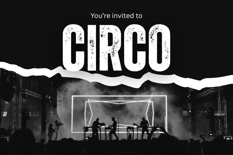
Subject ideas: “See the stage build—48 hours to go,” “Your wristband is ready (map inside)”
Template: “Picture this: [Vibe]. Doors at [Time]. Tap for your map, set times, and Add to Wallet/Calendar.”
Why it works: Visuals improve scannability and emotion while the CTA anchors action.
Best for: Ticket types with different needs (VIP vs. General), or attendees who pre‑selected interests. Use dynamic blocks to show recommended sessions or lounges.
Subject ideas: “Your sessions, your schedule—tap to confirm,” “We saved you a front‑row seat for [Track]”
Template: “Hey [First name], because you chose [Topic], we recommend: [Session A], [Session B]. Add them to your calendar with one tap.”
Why it works: Relevance boosts clicks and reduces decision friction on the day.
Best for: Destination events or complex venues. Sell the experience while removing logistics friction with maps, travel tips, transit/parking, and accessibility details.
Subject ideas: “How to get to [Venue]—parking, entrances, and security,” “Your city guide: coffee, lunch, Wi‑Fi spots near the venue”
Template: “Arriving at [Venue]? Enter via [Gate]. Best parking: [Lot]. Transit: [Line]. Save our map and on‑site perks (charging lockers, quiet rooms).”
Why it works: It reduces drop‑offs and makes the journey feel easy and welcoming.
Best for: B2B conferences and community events. Networking is a top attendance driver—show who they could meet and how to connect ahead of time.
Subject ideas: “Meet architects, PMs, and VPs—RSVP to the 16:30 mixer,” “Want 3 curated intros? Complete your profile”
Template: “Who you’ll meet: [Roles/Companies]. Join the topic meet‑ups at [Times]. Complete your profile for 3 curated intros.”
Why it works: It spotlights a primary motivator—useful connections—and gives a clear next step.
Best for: Workshops, labs, and virtual formats. Prime attendees with pre‑reads, slides, or setup instructions so they get more from the session.
Subject ideas: “Bring this checklist to the lab,” “Slides + templates for tomorrow’s masterclass”
Template: “To get the most from [Session], please download [Resource] and complete steps 1–2 (5 minutes). We’ll start hands‑on right away.”
Why it works: Reduces confusion at showtime and boosts perceived value.
Best for: Day‑of nudges and time‑sensitive updates. With consent, pair your email with a brief SMS: “We start in 15 mins—see your inbox for the link.” Keep SMS concise, include STOP instructions, and ensure opt‑in is clear and provable.
Subject ideas (email): “Happening now: join with one tap,” “We’re live—use your unique link”
SMS template (if consented): “Starts in 15 mins: [Event]. Check your email for the join link. Reply STOP to opt out.”
Why it works: Reinforces the message on the channel most likely to be seen right before start time.
Best for: Events where early attendance, commitment, or upfront registration matters. Ideal for audiences who value flexible policies, refundable options, or ticket transfers.
Why this matters:
In our Event Attendee Insights Report (2025), 33.8% of attendees said better refund policies would motivate them to buy tickets earlier, and 22.8% said the ability to resell or transfer their ticket would increase their likelihood to register. A well-timed reminder that highlights your flexible policies removes hesitation and reinforces trust—especially for first-time attendees or higher-priced events.
Subject line ideas:
“Your plans changed? You’re covered.”
“Flexible options for tomorrow’s event—here’s what to know.”
“Can’t make it? Refund or transfer your ticket in one tap.”
Template:
“Hi [First name], we’re looking forward to seeing you at [Event] on [Date].
If your schedule shifts, we’ve made it easy: your ticket comes with flexible refund and transfer options. You can request a refund or pass your ticket to a colleague in just a few clicks.
Tap below to view your options or confirm you're joining us tomorrow.
[Button: Manage My Ticket]
Either way, we've got you covered—and we hope to see you there.”
Why it works:
Flexibility reduces commitment anxiety. By reminding attendees that they’re protected—refunds, resells, or transfers—you remove the silent friction that often leads to late drop-offs or no-shows. It also demonstrates empathy and transparency, two traits that meaningfully increase trust and early registration.
Combine these fundamentals with the examples above to create a reminder programme that consistently increases attendance and satisfaction.
Segmentation: Tailor reminders by ticket type, location/time zone, interest, or session picks. Send VIPs earlier access details and perks; nudge first‑timers with logistics and confidence boosters.
Automation: Build a simple flow—7 days, 24 hours, 60/15 minutes before start. Localise send times and automatically skip steps once they’ve checked in or confirmed.
Timing: Test morning vs. lunch vs. late afternoon sends. For virtual events, the 1‑hour and 15‑minute reminders often carry the most weight.
A/B testing: Experiment with subject lines, sender names, and button copy. Use a “winner‑send” for your final reminder when your list size supports it.
Mobile optimisation: Design for dark mode, short screens, and quick comprehension—short paragraphs, bullets, 16–18px body text, and 44px+ CTAs.
Personalisation: Recommend sessions, surface relevant people to meet, and adapt by role or industry. Keep it transparent and helpful.
Deliverability & compliance: Authenticate (SPF, DKIM, DMARC), align your From domain, add an easy one‑click unsubscribe, and keep spam complaints under the threshold. Include a physical address and honour opt‑outs quickly.
Measurement: Optimise for clicks/RSVPs and attended rate. Because Apple’s Mail Privacy Protection skews open rates, track CTA clicks, calendar adds, and check‑ins instead.
SPF, DKIM, and DMARC authenticated; consistent From domain;
clear one‑click unsubscribe; complaint rate <0.3%;
plain‑text version included;
images compressed with descriptive alt text.
If you report on outcomes, you’ll also love our quick guide to choosing and tracking event KPIs. Tie your reminder sequence improvements directly to attendance rate, on‑time arrival, and NPS.
Accessibility isn’t optional—your reminder emails must be readable, navigable, and usable for every attendee, including those using assistive technology. Meeting ADA and WCAG guidelines also improves clarity for all readers, which directly lifts engagement and attendance.
Design and copy choices should ensure your reminders work across screen readers, mobile devices, and dark-mode environments:
Provide meaningful alt text for all images so screen readers can describe maps, buttons, or speaker photos. Keep it short and functional—e.g., “Map to venue entrance,” not “Beautiful illustration of…”.
Use sufficient color contrast (WCAG AA minimum) for text, backgrounds, and buttons. High-contrast CTAs improve both accessibility and click-through rates.
Avoid text baked into images. Screen readers can’t interpret it, and dark mode may invert colors unpredictably. Always pair visuals with live text.
Use semantic, structured headings (H1, H2, H3) so screen readers can navigate the email logically.
Make links and buttons keyboard- and screen reader-friendly, using real HTML buttons (not image buttons) with descriptive labels such as “Add to Calendar” instead of “Click here.”
Write concise, plain-language copy to reduce cognitive load. Clear instructions benefit readers with learning disabilities, non-native speakers, and mobile users alike.
More than half of email opens now occur in dark mode, and poorly formatted emails can become unreadable. Ensure your reminder emails adapt gracefully:
Use transparent PNGs or SVGs where possible, avoiding images with baked-in dark backgrounds that clash when inverted.
Choose brand colors that hold contrast in both modes—test your CTAs, accents, and logos against light and dark backgrounds.
Avoid pure black or pure white backgrounds that can create visual strain; use off-white or soft dark tones that render more consistently across devices.
Test in real clients (Gmail, iOS Mail, Outlook) because each handles dark-mode inversion differently—especially if you use gradients, shadows, or background images.
Calendar adds are one of the strongest attendance boosters—once the event lives inside the attendee’s schedule, reminders, alerts, and time-zone adjustments happen automatically. Pairing ICS files with deep links to maps, sessions, or virtual rooms removes friction and makes “showing up” the default.
Getting your ICS/iCalendar setup right ensures every attendee sees accurate, device-friendly event details:
Include complete metadata (title, localised time, description, venue/join link, doors-open time, support contact). Missing details lead to confusion and day-of drop-offs.
Use standard ICS formatting so Google, Apple, and Outlook interpret your file consistently. Avoid niche fields that break across clients.
Embed the primary link inside the calendar event—map URL, virtual join link, or registration portal. Attendees rely on this link when they're in motion.
Attach reminders within the ICS file (e.g., 30 minutes and 10 minutes before). Native calendar notifications are more reliable than email opens.
Deep links get attendees exactly where they need to be—on site, in the correct session, or inside the virtual room—without hunting through old emails.
Use platform-safe deep links (https or native app links) that work across iOS, Android, and desktop. Test each link against your audience’s most common devices.
Point to the exact destination—floor plan, gate entrance, breakout room, or live session—rather than a generic landing page. The fewer taps, the higher the attendance rate.
Keep URLs stable. Changing a deep link after ICS files are downloaded can break access for thousands of attendees.
Add fallback links for older devices or email clients that can’t interpret deep links, ensuring there's always a working path.
In 2026, your toolkit should make personalisation, testing, and deliverability easier—not harder. Choose platforms that support authentication, one‑click unsubscribe, and robust A/B testing natively.
Event management platforms: Tools like Eventbrite and Cvent can centralise registrations, sessions, and attendee data. For a single source of truth across ticketing, reminders, and on‑site ops, explore our event software capabilities to see how Loopyah streamlines the entire workflow.
Email marketing software: ESPs such as Mailchimp, HubSpot, and enterprise providers offer automation flows, dynamic content, and AMP support. Look for audience segmentation, send‑time optimisation, and easy calendar attachment insertion.
SMS services: When consented, SMS complements email with day‑of nudges. Ensure clear opt‑in, easy opt‑out (STOP), and local compliance.
Event reminder emails are your last‑mile advantage. When they’re authenticated, mobile‑first, and personalised, they make attending the easiest—and most obvious—choice. Use the 15 event reminder email examples above to build a reusable sequence: start with a basic reminder, layer in value and agenda previews, spotlight speakers, and finish with last‑chance + day‑of nudges. Along the way, test subject lines, keep your copy crisp, include calendar links everywhere, and measure what matters: clicks, RSVP confirmations, and actual attendance.
If you’re refreshing your entire pre‑event funnel, combine the tactics here with our event marketing ideas and event landing page resources for a full‑stack upgrade.
